Great find! It's nice to know that about Tape 05. It has that handmade feel of the Old Tunes artwork, and I love it for that.Den wrote:Robert Beatty: “I've been credited a few places with doing the artwork for the Boards of Canada album - wanted to clarify I didn't do the album artwork or the VHS, just the trailer and the "Introit/Prophecy At 1420 MHz" video (so far…)”
He also said that Mike and Marcus made Tape 05.
Inferno Artsyle Discussion
Moderators: Aesthetics, Drones, Hexagon Sun
-
harpoon dodger
- Dayvan Cowboy
- Posts: 2342
- Joined: Fri Nov 10, 2006 7:20 pm
- Location: Ontario, Canada
- Contact:
Re: Inferno Artsyle Discussion
The preparation for a dive is always a tense time.

Re: Inferno Artsyle Discussion
Yes, I also had the feeling that Tape 05 was all Hexagon Sun.
-
turquoise70
- Happy Cycler
- Posts: 4901
- Joined: Thu Jun 07, 2007 12:30 am
- Location: the system
- Contact:
Re: Inferno Artsyle Discussion
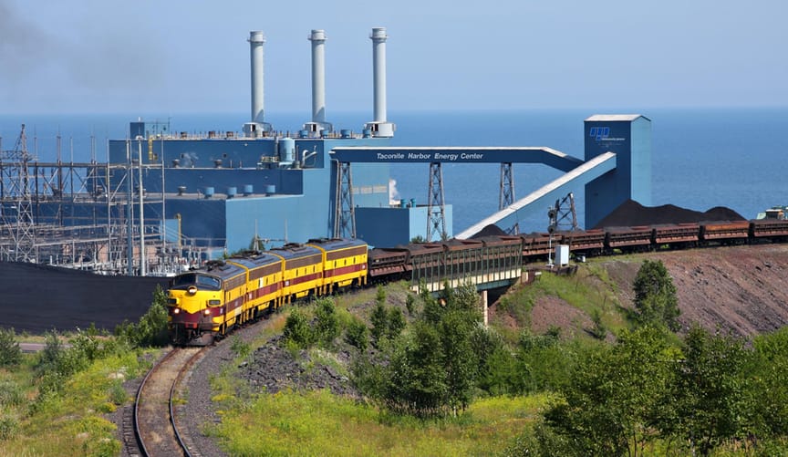
Same! A lot of Northern Minnesota is just like that, too. No shock that their descriptions of imagery resonated with me in a way I'd never heard an artist draw upon.The Other wrote:I remembered this quote from NME February of 2002.
Sandison: "My memory of Calgary is a picture of boxy 1970s office blocks dumped in the middle of nowhere against a permanent sunset."
https://bocpages.org/wiki/The_Secret_Li ... _of_Canada
It's cool to see that they still draw inspiration from memories like this. I remember when I read that quote it stuck with me. I have travelled to places where certain buildings seem very out of place and juxtaposing in relation to its surroundings. Sort of falls in line with idea of "Somewhere Right Now In The Future." To me it does anyway... sort of like looking ahead to what could've been or might be.
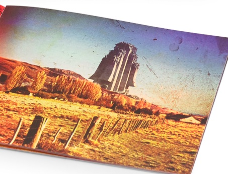
That's where I'm from and it's where a lot of Boreal Network's imagery draws upon too.
"grand mistress of the grace note freedledeedee melodies" - Cupz, 2026
-
noveltywave

- Boqurant
- Posts: 71
- Joined: Sun Jul 21, 2024 1:32 pm
Re: Inferno Artsyle Discussion
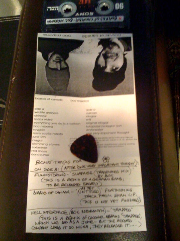
This might have already been noticed by someone, but I noticed the handwritten notes on the Boc Maxima tape given to a friend have the new logo on them (or just a flower).
https://bocpages.org/w/images/Bocmaxima ... dealer.jpg
https://bocpages.org/w/images/Bocmaxima ... dealer.jpg
-
Redd Panderson

- Eagle Minded
- Posts: 295
- Joined: Fri Apr 10, 2026 12:36 pm
Re: Inferno Artsyle Discussion
Ooh interesting. Tough call since the pic is a bit blurry in that spot and it does look like a flower, but the resemblance could be something.noveltywave wrote:This might have already been noticed by someone, but I noticed the handwritten notes on the Boc Maxima tape given to a friend have the new logo on them (or just a flower).
https://bocpages.org/w/images/Bocmaxima ... dealer.jpg
TBH, too, I kinda get Red Moss vibes from Prophecy at 1420 MHz. I appreciate how timeless their sound is--all of their stuff has a bit of everything else in it, but in a really good way. It's like their broadcasting from outside of time.
Verde Hexagon Hashbrown
Re: Inferno Artsyle Discussion
The hexagon morphs into a flower in the Inferno trailer.
I’m so excited to hold the physical album.
I’m so excited to hold the physical album.
-
Redd Panderson
- Eagle Minded
- Posts: 295
- Joined: Fri Apr 10, 2026 12:36 pm
Re: Inferno Artsyle Discussion
Okay so I've got chills running down my spine. I just went to see Backrooms in theaters today and, without spoiling anything, all I have to say is GET OUT OF MY HEAD.Redd Panderson wrote:Bringing in an idea I brought up in the general Inferno thread because it applies to the cover. It has to do with the idea of our past, present, and future selves being contained in this one moment and how parts of ourselves get frozen in the past.
It involves behavioral loops that get stuck on repeat in our psyches as we age and continue to manifest as similar situations in our lives over and over. It's like the negative edge of nostalgia. Not necessarily trauma, but the momentum of habit that we are often blind to while ending up in the same difficult situations time and again.
Also related to loops: feedback. The closed loop producing monstrous things with exaggerated features in our lives, dreams, and societies, frightening us until we can cultivate enough equanimity to face them head-on. I think that exaggerated, maybe even cartoonish, character of our demons when left unchecked kind of fits with the bit of camp in the design for Inferno.
I already said it somewhere else, but, to me, I'm getting the feeling this isn't strictly a dark album, but also about the process of turning to face your demons--individually and as a society--in order to transcend and move beyond them. To thaw the frozen parts inside. To befriend those exiled aspects of our psyche so we can rescue ourselves from the havoc they can wreak when left unchecked.
So I appreciate the kind of horror, kind of camp look. There's a funhouse mirror yet sinister look and I do think it all has some parallel to what some people call shadow work.

Bringing back what I wrote here over a month ago, go watch the movie.
Verde Hexagon Hashbrown
Re: Inferno Artsyle Discussion
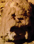
Like most art, it looks a lot better offline than it does on a screen. There's so much detail in these images and it really assists the narrative of the record.
The Baddest Alt Electronic Pop Music: Twenty20k.comBiznasty wrote:off to the pub... /// --- ..-. ..-. / - --- / - .... . / .--. ..- -... .-.-.- .-.-.- .-.-.-
How BOC feels about: Censorship | Environment | The World | A New Album
-
ColinWallis
- Eagle Minded
- Posts: 277
- Joined: Mon Aug 24, 2020 11:28 pm
Re: Inferno Artsyle Discussion
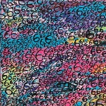
One of their best album covers in my opinion. To me it feels like the missing puzzle piece of their artworks in every way. The large font was unexpected, but it's suiting to the composition.
It's a little reminiscent of both Music Has the Right and Campfire Headphase, but a new take on the distorted faces.
I really love how it looks kind of spooky, but it's probably a really happy photo.
10/10
It's a little reminiscent of both Music Has the Right and Campfire Headphase, but a new take on the distorted faces.
I really love how it looks kind of spooky, but it's probably a really happy photo.
10/10
Re: Inferno Artsyle Discussion
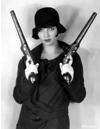
Absolutely. As I was spinning the record I flipped through the booklet and they really captured the narrative extremely well. There were times I felt like I was looking at the exact picture I needed to be looking at while a song was on.2020k wrote:Like most art, it looks a lot better offline than it does on a screen. There's so much detail in these images and it really assists the narrative of the record.
I do think the same could be said about TCH and TH to some degree. Maybe because Inferno is so new and fresh it is resonating a bit more but, I agree.
-
Sherbet Head
- Sherbet Head
- Posts: 599
- Joined: Sat Oct 21, 2017 4:56 pm
- Location: Cold Earth
Re: Inferno Artsyle Discussion
Made a semi-interesting discovery while watching the Inferno promo vid that BoC shared on release day.
The shot of the dove, immediately before the Boards logo appears, was recorded at Tintern Abbey, not too far from where I live.
Is this stock footage or were the bros/Robert Beatty in my neck of the woods?!
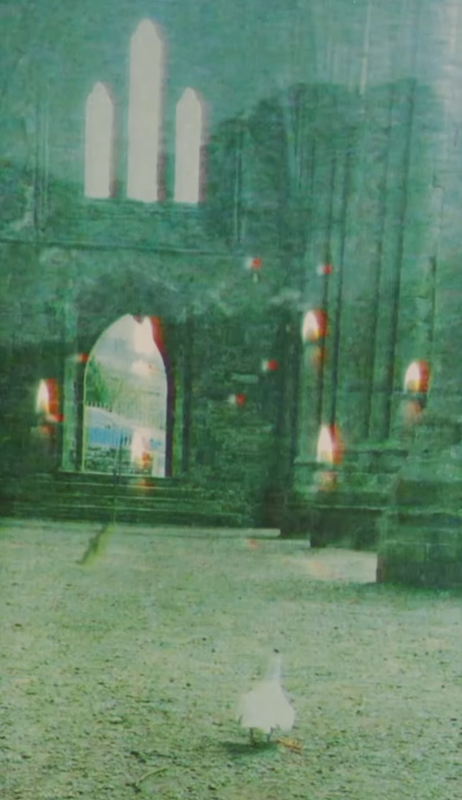
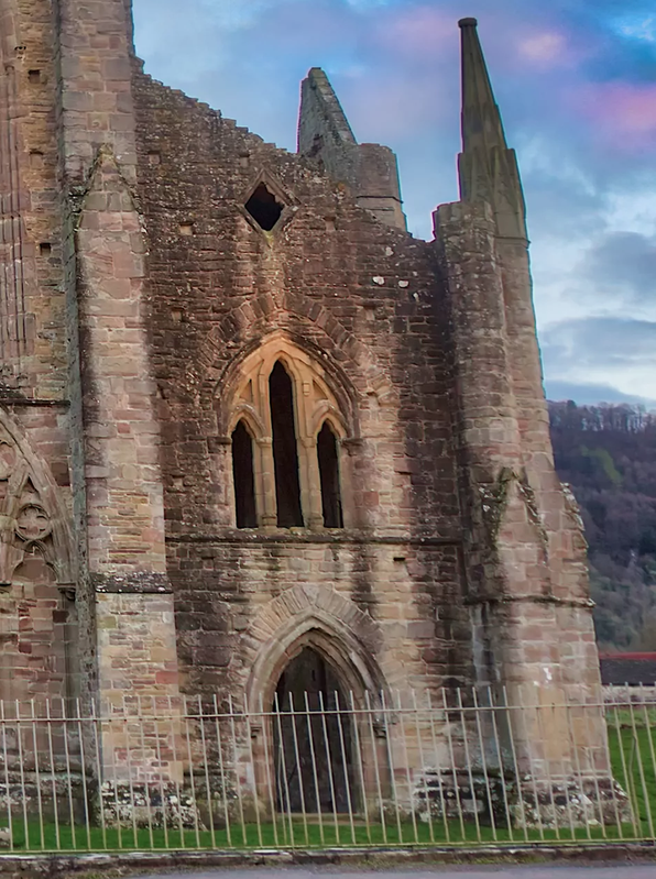
The shot of the dove, immediately before the Boards logo appears, was recorded at Tintern Abbey, not too far from where I live.
Is this stock footage or were the bros/Robert Beatty in my neck of the woods?!
-
joeblackcircles

- New Seed
- Posts: 6
- Joined: Sun May 31, 2026 11:25 am
Re: Inferno Artsyle Discussion
Thank you! I was convinced that the monument in the collage was AI generated but you've convinced me otherwise.Quiller wrote:People have ID'd these as the 300 Aragvians Monument in Zhinvali, Georgia and Canadian War Museum in Ottawa, Canada.
Re: Inferno Artsyle Discussion
On the back cover, directly to the left of the Boards of Canada title, the landscape is green in contrast to the rest of the canyon. There’s so much more discernible detail in the art when looking at a physical record.
Re: Inferno Artsyle Discussion
Another discovery: I was looking at The Campfire Headphase inner-sleeve art and there is a photo of people on horseback with hexagons overlaid onto the sky…