Page 2 of 3
Posted: Wed Jun 12, 2013 10:06 pm
by purgruv
One thing I noticed is the absence of people, I think all the other albums have human figures on them right?
Posted: Wed Jun 12, 2013 10:10 pm
by Aerial Boundaries
purgruv wrote:One thing I noticed is the absence of people, I think all the other albums have human figures on them right?
Yes, although the overall artwork does in fact have pictures of people. But so distant and alienated, really beautiful.
Posted: Wed Jun 12, 2013 10:13 pm
by d e n
HOLY SHIT!
NYC metro has some crazed stuff going on but that was by far the most wild thing i've ever seen involving the underground...
i have to admit i couldn't stop laughing at points such as when he just fell to the floor and executed perfect flips and doing handstands on the turn style.
Posted: Thu Jun 13, 2013 1:12 am
by optic
I recently got to go on an all expenses paid junket to SF for a conference, my first one ever after slaving for 17 years for The Man (in the field I'm in currently...I've been slaving for far longer than that). I reconnected with the psychedelic side of my brain there (the conf. was shite, and I was left pretty much to my own devices for 5 days). It was personally very meaningful to me. That was a month ago. I come home and pretty much then next day, I see the cover with SF (at least to my mindset at the time) shining like a beacon. This is why I'm so interested in the meaning of it.
Posted: Thu Jun 13, 2013 5:32 am
by re-phaelam-ed
F. wrote:re-phaelam-ed wrote:I live here too...but as beautiful as this city may be....it's a dirty, smelly, over priced, over stressed town. Aggressive homeless everywhere...smells like piss and shit on every corner. Garbage EVERYWHERE. Everyone's stressed out cuz there money barely covers rent (fuck living in the tenderloin unless you don't mind being accosted everyday or wanna risk getting stabbed walking home at night) NO PARKING ANYWHERE. Sure the presidio is nice...and sea cliff, but I don't have upwards of 5k a month for rent, or a couple million burning a hole in my pocket for a tiny house with no yard. I find the album cover fitting. This place feels like a city on the brink of a meltdown.
Nice to visit. SHITTY to live in..
SoCal for me (trapped here because of werk that doesn't pay enough to build a future)
http://nymag.com/daily/intelligencer/2013/06/naked-man-san-francisco-bart-subway-video.html
sweet san fran...par for the course.
Posted: Fri Jun 14, 2013 6:20 pm
by SneakyTT
I found a rainbow!
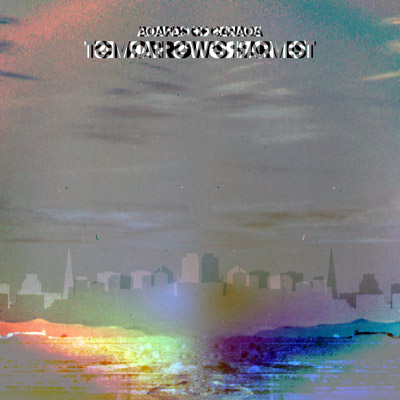
I inverted and horizontally flipped the cover, overlaid it on the original, then added 70 contrast.
Posted: Fri Jun 14, 2013 7:34 pm
by SneakyTT
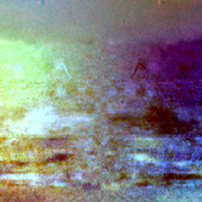
And zooming into the bottom, with 26 more contrast... a god with horns??
Posted: Fri Jun 14, 2013 7:48 pm
by hexagon son
Meh, they should've used Vancouver's backdrop but I love the cover all the same. I've only looked at my book and postcards once. I dont want to touch them again!

Posted: Fri Jun 14, 2013 7:53 pm
by Moloch
After receiving my vinyls, I must say the artwork is like a movie poster. BOC is the director, TH is the movie, like Boards Of Canada's 'Tomorrow's Harvest'.
Posted: Fri Jun 14, 2013 8:04 pm
by re-phaelam-ed
SneakyTT wrote:And zooming into the bottom, with 26 more contrast... a god with horns??
ha ha ha look even closer...i can see the spy vs spy guys HA HA HA
ill point it out....
Posted: Fri Jun 14, 2013 8:08 pm
by re-phaelam-ed
SPY vs SPY h aha ha ha

Posted: Fri Jun 14, 2013 8:12 pm
by SneakyTT
re-phaelam-ed wrote:SPY vs SPY h aha ha ha
I see them!! Wow... the rabbit hole gets deeper and deeper...
Posted: Fri Jun 14, 2013 9:04 pm
by optic
SneakyTT wrote:re-phaelam-ed wrote:SPY vs SPY h aha ha ha
I see them!! Wow... the rabbit hole gets deeper and deeper...
This album is about the Cold War, after all...
Posted: Fri Jun 14, 2013 10:13 pm
by purgruv
Moloch wrote:After receiving my vinyls, I must say the artwork is like a movie poster. BOC is the director, TH is the movie, like Boards Of Canada's 'Tomorrow's Harvest'.
Got it at last?? Cool, nothing for me here…
Posted: Fri Jun 14, 2013 10:16 pm
by purgruv
SneakyTT wrote:I found a rainbow!
I inverted and horizontally flipped the cover, overlaid it on the original, then added 70 contrast.
Yep, i get the same results, i wonder if it does is with any sunset image with this technique or is an intentional thing…
Posted: Fri Jun 14, 2013 11:02 pm
by re-phaelam-ed
SneakyTT wrote:re-phaelam-ed wrote:SPY vs SPY h aha ha ha
I see them!! Wow... the rabbit hole gets deeper and deeper...
ha ha ha i was just being silly.
you can see what you wanna see if you stare at it long enough
Posted: Sat Jun 15, 2013 12:03 am
by ZosoCon
I like San Fran as a city, but would of expected an unrecognizable/less recognizable city for a Boards of Canada album cover honestly. Maybe even a bit cliché? Anyway, could have been worse...could have been New York City.
Posted: Sat Jun 15, 2013 12:08 am
by optic
ZosoCon wrote:I like San Fran as a city, but would of expected an unrecognizable/less recognizable city for a Boards of Canada album cover honestly. Maybe even a bit cliché? Anyway, could have been worse...could have been New York City.
indeed.
Posted: Sat Jun 15, 2013 6:58 am
by pianoforte
re-phaelam-ed wrote:....it's a dirty, smelly, over priced, over stressed town. Aggressive homeless everywhere...smells like piss and shit on every corner. Garbage EVERYWHERE. Everyone's stressed out cuz there money barely covers rent (fuck living in the tenderloin unless you don't mind being accosted everyday or wanna risk getting stabbed walking home at night) NO PARKING ANYWHERE. Sure the presidio is nice...and sea cliff, but I don't have upwards of 5k a month for rent, or a couple million burning a hole in my pocket for a tiny house with no yard. I find the album cover fitting. This place feels like a city on the brink of a meltdown.
Nice to visit. SHITTY to live in..
SoCal for me (trapped here because of werk that doesn't pay enough to build a future)
Yeah, I live in Southern California myself, and when I visited SF it just seemed kinda scary and gross. Granted, I was walking around in the Haight-Ashbury district and Golden Gate Park, but I spent a pretty decent amount of time in other areas as well and came away with a pretty negative impression on the whole. I don't think I'll be going back there any time soon.
Posted: Sat Jun 15, 2013 7:01 am
by pianoforte
SneakyTT wrote:And zooming into the bottom, with 26 more contrast... a god with horns??
personally, I see two UFO's.