Page 2 of 8
Posted: Thu Jan 14, 2010 4:09 am
by jonnyjj74
the letter p wrote:incunabula live 93 is reminiscent of quaristice live 08.
i wonder if the album cover eludes to the band coming full circle.
It's probably just a circle.
The live 08 set has the same essence as their other live sets during their career, in my opinion, barring the rhythmic madness of the Confield tour where they used a lot of Max patches.
Posted: Thu Jan 14, 2010 4:36 am
by Skytree
Their new Myspace page is fun to play around with..lots of nice glitchy coding that fits the aesthetic of the new album art.
Posted: Thu Jan 14, 2010 7:50 am
by dave_from_2001
Motherwell vs. Miami
I predict a rude sickness with this LP
Posted: Thu Jan 14, 2010 10:41 am
by crater
Posted: Thu Jan 14, 2010 1:29 pm
by Patryk Ludamage
Joebot Kill wrote:A big black dot
A big black dot beat a big bad bit ?

Posted: Thu Jan 14, 2010 5:10 pm
by Joebot Kill
EDIT: hmm! I feel kind of slow. But OK. Warp did replace their logo on the website with this. But doesn't it kind of defeat the purpose if it says "autechre" written over it?
Posted: Thu Jan 14, 2010 11:20 pm
by Neels
Patryk Ludamage wrote:Joebot Kill wrote:A big black dot
A big black dot beat a big bad bit ?
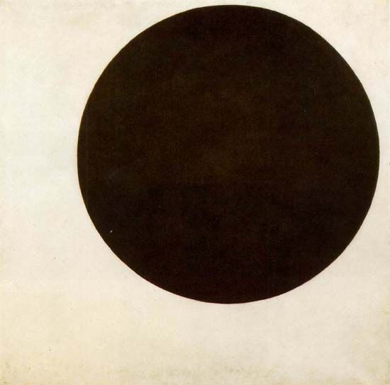
It seems that all of these designs are inspired on 'Black circle' (1915!!) of Malevich.
Check out wiki:
http://en.wikipedia.org/wiki/Kazimir_Malevich
Posted: Fri Jan 15, 2010 12:04 am
by dave_from_2001
I believe this cover artwork to be firmly rooted in abstract expressionism. It has an intensity that supermatism cannot produce without German self-denial.
Posted: Fri Jan 15, 2010 1:45 am
by Joebot Kill
I really do LIKE the cover overall. It's just such a common symbol these days. It's weird to me that they would pick that.
Posted: Fri Jan 15, 2010 2:54 am
by (parenthesis)
Joebot Kill wrote:I really do LIKE the cover overall. It's just such a common symbol these days. It's weird to me that they would pick that.
Ae's album art always has a simplistic feel to it, but Confield's artwork is my favorite.
Posted: Fri Jan 15, 2010 7:26 am
by Joebot Kill
(parenthesis) wrote:Joebot Kill wrote:I really do LIKE the cover overall. It's just such a common symbol these days. It's weird to me that they would pick that.
Ae's album art always has a simplistic feel to it, but Confield's artwork is my favorite.
simplistic, yes i agree. but there was something 100% distinct about, for instance, the quaristice cover. when you see those black and white squares, you know what it is. But when you see this hand painted black dot. It's still beautiful, but man that shit is everywhere. I do think that in combination with the text though, the cover looks amazing.
Posted: Fri Jan 15, 2010 7:33 am
by Joebot Kill
Joebot Kill wrote:EDIT: hmm! I feel kind of slow. But OK. Warp did replace their logo on the website with this. But doesn't it kind of defeat the purpose if it says "autechre" written over it?
would tDR really choose to use adbusters' black spot campaign as their artwork? i thought that had been their statement from the start. do they really need to borrow an idea from someone else? or are they working to promote a common goal? for all i know tDR could be working with adbusters? am i thinking too hard about this? my head hurts.
Posted: Fri Jan 15, 2010 8:49 pm
by Patryk Ludamage
Neels wrote:Patryk Ludamage wrote:Joebot Kill wrote:A big black dot
A big black dot beat a big bad bit ?
It seems that all of these designs are inspired on 'Black circle' (1915!!) of Malevich.
Check out wiki:
http://en.wikipedia.org/wiki/Kazimir_Malevich
Autechre inspired of Malevich artworks? Hope it is )
Posted: Sat Jan 16, 2010 4:32 am
by Chuck Beckles
Making album art for Autechre has to be frustrating. I guess they gave up.
Posted: Sat Jan 16, 2010 9:00 am
by novayshun
Chuck Beckles wrote:Making album art for Autechre has to be frustrating. I guess they gave up.
lol?
Posted: Sat Jan 16, 2010 8:17 pm
by Chuck Beckles
novayshun wrote:Chuck Beckles wrote:Making album art for Autechre has to be frustrating. I guess they gave up.
lol?
It's gotta be hard to do their music justice, so they usually end up doing something really minimal, to leave a lot to the the imagination. The closest they came was Draft 7.30, I think. I also really liked Quaristice's cover.
I dunno, I'm not exactly shitting ice cream over the black dot. But I bet I will about the music.
Posted: Sun Jan 17, 2010 12:56 am
by Joebot Kill
Chuck Beckles wrote:novayshun wrote:Chuck Beckles wrote:Making album art for Autechre has to be frustrating. I guess they gave up.
lol?
It's gotta be hard to do their music justice, so they usually end up doing something really minimal, to leave a lot to the the imagination. The closest they came was Draft 7.30, I think. I also really liked Quaristice's cover.
I dunno, I'm not exactly shitting ice cream over the black dot. But I bet I will about the music.
haha they'd probably say that the cover of draft is "too obvious" or something like that.
ae - twisting and bending polygons? pfft ANYONE could come up with that!
alex rutterford - but rob, it took me 300 hours to digitally sculpt!
ae - *sigh* fiiiiine. we'll use it.
i think i like the chiastic slide/envane stuff the most. but i think every one of their albums is really well-designed and awesome looking. even tri repetae!
Posted: Sun Jan 17, 2010 2:34 am
by dave_from_2001
Chuck Beckles wrote:novayshun wrote:Chuck Beckles wrote:Making album art for Autechre has to be frustrating. I guess they gave up.
lol?
It's gotta be hard to do their music justice, so they usually end up doing something really minimal, to leave a lot to the the imagination. The closest they came was Draft 7.30, I think. I also really liked Quaristice's cover.
I dunno, I'm not exactly shitting ice cream over the black dot. But I bet I will about the music.
if that's "just" a black dot AE tracks are "just" noise.
anyway, for anyone who completed an order, how much cash did this turn out to be for USA, with the shipping? thanks.
Posted: Sun Jan 17, 2010 2:56 am
by The Telepathic Kid
to me the Draft album cover looks like a machine falling apart, which is what Ae's music kinda sounds like.
Posted: Sun Jan 17, 2010 6:28 am
by Joebot Kill
dave_from_2001 wrote:Chuck Beckles wrote:novayshun wrote:Chuck Beckles wrote:Making album art for Autechre has to be frustrating. I guess they gave up.
lol?
It's gotta be hard to do their music justice, so they usually end up doing something really minimal, to leave a lot to the the imagination. The closest they came was Draft 7.30, I think. I also really liked Quaristice's cover.
I dunno, I'm not exactly shitting ice cream over the black dot. But I bet I will about the music.
if that's "just" a black dot AE tracks are "just" noise.
anyway, for anyone who completed an order, how much cash did this turn out to be for USA, with the shipping? thanks.
It's an immediate and powerful image. every black circle that has been posted in this thread is an entirely different
black circle. here it is presented as something to get lost in. it's the first time we've seen any form of organic expression in any of their artwork as well. unless you count the photo for amber.
and with shipping the vinyl ended up coming to about 60 dollars
