every day for me in work:
http://www.youtube.com/watch?v=VfprIxNfCjk
TCH font
Moderators: Aesthetics, Drones, Hexagon Sun
-
Closing_Logo
- Friendly Stranger
- Posts: 31
- Joined: Mon Dec 25, 2006 3:36 am
- Location: Vancouver, BC
from xltronic:
Music Has The Right To Children: ITC Bauhaus, play with the kerning values
In A Beautiful Place Out In The Country: AvantGarde, again, play with kerning values to get the right effect. (Twoism sticker as well)
Geogaddi: Debussy
Twoism, Acid Memories: Handwritten font
Catalog 3: Impact
BOC Maxima: Eurostyle
Hi Scores: OCR A or B
Music Has The Right To Children: ITC Bauhaus, play with the kerning values
In A Beautiful Place Out In The Country: AvantGarde, again, play with kerning values to get the right effect. (Twoism sticker as well)
Geogaddi: Debussy
Twoism, Acid Memories: Handwritten font
Catalog 3: Impact
BOC Maxima: Eurostyle
Hi Scores: OCR A or B

-
dave_from_2001

- Sherbet Head
- Posts: 738
- Joined: Thu Sep 29, 2005 4:19 am
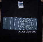
phineas wrote:speaking of kerning
i always thought whoever the designer of the TCH cover was should've fixed the problem with the "A"s
esp. that last one thats hanging out there by itself
I'm feeling you but upon inspection it looks like they were trying to rhyme the "of". and the bo and of are capped by that last floating a. bit more natural 2-2-1 not 2-2-2 or 2-2-0 which would stick out. its perfectly balanced.
dave_from_2001 wrote:
I'm feeling you but upon inspection it looks like they were trying to rhyme the "of". and the bo and of are capped by that last floating a. bit more natural 2-2-1 not 2-2-2 or 2-2-0 which would stick out. its perfectly balanced.
i see what you're saying
but i think there is a difference between actual balance and visual balance
i just think it would look alot better like this:
