bocpages logo/banner contest

Moderators: Aesthetics, Drones, Hexagon Sun

Locked

Should the current bocpages logos be replaced?

Yes, it's long overdue!
24
48%
No, it's fine like it is.
19
38%
I couldn't care less.
7
14%
 
Total votes: 50

User avatar
Fredd-E
Drone Operator
Posts: 4662
Joined: Sun Nov 28, 2004 12:39 am
Contact:

bocpages logo/banner contest

Post by Fredd-E »

UPDATE: Read all the current info about the competition here: http://bocpages.org/wiki/bocpages:Skins#Info


UPDATE2: Second part of the contest over. A voting thread will be opened soon to determine the winners.

I've been thinking lately to have the current two logos I use on bocpages.org replaced by something unique and specific to the wiki. Preferably just one logo and/or a complete banner. Why you might ask? Well, even though I do think the current logos look fine, it's that I kinda detest the fact that it's their official logos which I'm using for an unofficial site. It feels wrong to do so.

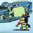
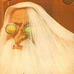
The logos I'm currently using and wanting to replace asap:
Image Image

I thought it would be nice to make this into a contest. I know we have a couple of great graphic designers on this board and probably a lot more amongst all the boc fans. That's why this contest will also be promoted on twitter and facebook with links pointing towards this thread.

The guidelines:
  • the design has to be related to boc in some way
  • a minimalistic design, less is more
  • clean and anti aliased
  • preferably vector graphics (scalability is important)
  • it should match the current colour scheme: green (#7E9E4F) and turquoise (#87C4BF)
Please send your creations by mail towards fredd-e [at] bocpages [dot] org

After the deadline (5th of december 2009) has passed there will be a poll which will showcase the most appropriate designs if any. These designs will then become eligible to be chosen by the forum members as the final new design for the wiki. Based upon the design of the logo/banner this might imply the general colour scheme of the wiki could change to something entirely new, if feasible.

The winner of the contest, as a return favor, will of course be mentioned on the wiki with a link to his/her website by means of free publicity.

Who's in?
Last edited by Fredd-E on Mon Dec 07, 2009 6:34 am, edited 9 times in total.
User avatar
Pantheon
Sherbet Head
Posts: 796
Joined: Sun May 18, 2008 2:27 pm
Location: Edinburgh, Scotland

Post by Pantheon »

I think it looks great just the way it is
User avatar
jakestott
Dayvan Cowboy
Posts: 1378
Joined: Tue Jul 01, 2008 12:49 am
Location: Bolton, Greater Manchester

Post by jakestott »

Pantheon wrote:I think it looks great just the way it is
User avatar
Fredd-E
Drone Operator
Posts: 4662
Joined: Sun Nov 28, 2004 12:39 am
Contact:

Post by Fredd-E »

Yes, it does look fine like it is, but I kinda "hate" the fact that it's their official logo. I should not be using that for an unofficial site... it bothers me a bit.
User avatar
Joebot Kill
Dayvan Cowboy
Posts: 1558
Joined: Wed Jun 13, 2007 5:44 am
Location: Worcester, Massachusetts
Contact:

Post by Joebot Kill »

i dunno, have they ever really had an official logo? i mean, neither of those images have ever been on any of their albums. they arent even on their website. i personally really like it as well. but still, what kind of logo were you looking for? something simple, along those lines i'm assuming?
FUTURE FOREST DESIGN:
http://www.futureforestdesign.net

MOSS ARCHIVE MUSIC COLLECTIVE:
http://www.mossarchive.net
User avatar
Fredd-E
Drone Operator
Posts: 4662
Joined: Sun Nov 28, 2004 12:39 am
Contact:

Post by Fredd-E »

Joebot Kill wrote:i dunno, have they ever really had an official logo? i mean, neither of those images have ever been on any of their albums. they arent even on their website. i personally really like it as well. but still, what kind of logo were you looking for? something simple, along those lines i'm assuming?
They've used it on their official merchandise... that makes it official to me. And yes, like mentioned on the guidelines list, I want something minimal, but still boc related. It doesn't have to be something spectacular. It just needs to feel right and great on its own.
User avatar
polar sky
Happy Cycler
Posts: 4346
Joined: Thu Apr 13, 2006 7:20 pm
Location: US
Contact:

Post by polar sky »

I think the current banner fits! It's simple and clean.
User avatar
Patryk Ludamage
Sherbet Head
Posts: 700
Joined: Fri Sep 25, 2009 5:59 am
Location: The Soviet Russia, where is vodka, bears and very cold winters
Contact:

Post by Patryk Ludamage »

I've created some stuff, hope you need something like this?

Image Image

Image Image

Image Image

Image Image
Last edited by Patryk Ludamage on Thu Oct 15, 2009 4:37 pm, edited 6 times in total.
User avatar
The Other
Dayvan Cowboy
Posts: 2372
Joined: Thu Feb 23, 2006 10:17 pm
Location: Things Betwixt

Post by The Other »

unless you got a really good design to replace it, i would keep it as is.
User avatar
polar sky
Happy Cycler
Posts: 4346
Joined: Thu Apr 13, 2006 7:20 pm
Location: US
Contact:

Post by polar sky »

Image :lol:
User avatar
zeitgeist
Dayvan Cowboy
Posts: 1416
Joined: Thu Sep 20, 2007 9:51 pm
Location: where teh wild things are

Post by zeitgeist »

^this.
User avatar
Snufkin
Sherbet Head
Posts: 739
Joined: Sat Sep 26, 2009 2:55 pm

Post by Snufkin »

Fredd-E wrote:
Joebot Kill wrote:i dunno, have they ever really had an official logo? i mean, neither of those images have ever been on any of their albums. they arent even on their website. i personally really like it as well. but still, what kind of logo were you looking for? something simple, along those lines i'm assuming?
They've used it on their official merchandise... that makes it official to me. And yes, like mentioned on the guidelines list, I want something minimal, but still boc related. It doesn't have to be something spectacular. It just needs to feel right and great on its own.
When I saw this thread at first I thought Hell no don't change the logo!, but seeing your reason I now quite agree with you...! :)

I reckon the winning one needs to have been drawn by a child though... personally.. :)

*begins crayon doodling!* >_<]

-Snuf
User avatar
celadon
Eagle Minded
Posts: 430
Joined: Sun Apr 02, 2006 10:56 am
Location: Ireland

Post by celadon »

Nicely articulated FreddE. Looking forward to the results of this 8)
rED ORAnge YELLow grEEn blUe inDIGo violEt
ricHArd OF yorK GAvE baTTle in vAIn
ROYGBIV
Released! Oh Yes! Gonna Buy It Vinyl!
B&Q
User avatar
Tekmosis
Sherbet Head
Posts: 591
Joined: Fri Jun 12, 2009 9:08 pm

Post by Tekmosis »

[img]


THIS ONE!!!!!!!!!!!
User avatar
polar sky
Happy Cycler
Posts: 4346
Joined: Thu Apr 13, 2006 7:20 pm
Location: US
Contact:

Post by polar sky »

Tekmosis wrote:[img]


THIS ONE!!!!!!!!!!!
Not a fan of the font.
User avatar
Joebot Kill
Dayvan Cowboy
Posts: 1558
Joined: Wed Jun 13, 2007 5:44 am
Location: Worcester, Massachusetts
Contact:

Post by Joebot Kill »

Patryk Ludamage wrote:I've created some stuff, hope you need something like this?

Image Image

Image Image

Image Image

Image Image
even still, these are all based off of BoC's pre-existing designs. So it kind of defeats the point...
FUTURE FOREST DESIGN:
http://www.futureforestdesign.net

MOSS ARCHIVE MUSIC COLLECTIVE:
http://www.mossarchive.net
User avatar
Patryk Ludamage
Sherbet Head
Posts: 700
Joined: Fri Sep 25, 2009 5:59 am
Location: The Soviet Russia, where is vodka, bears and very cold winters
Contact:

Post by Patryk Ludamage »

Joebot Kill wrote:even still, these are all based off of BoC's pre-existing designs. So it kind of defeats the point...
Yes - it is - but what can you offer the something different?
I would like to see more others boc-fellows works :)
User avatar
(parenthesis)
Sherbet Head
Posts: 679
Joined: Fri Jun 05, 2009 6:56 pm
Contact:

Post by (parenthesis) »

well, I originally set out to make a boc banner, but got carried away..

Image
No, I won't. Please go away. I don't like you.
User avatar
dave_from_2001
Sherbet Head
Posts: 738
Joined: Thu Sep 29, 2005 4:19 am

Post by dave_from_2001 »

Image

i like the right side of this here. its computery and reminds me of nostalgic computer things, which is perfect because the bocpages is on the computer. i vote for the right side of this.
User avatar
nick47
Sherbet Head
Posts: 872
Joined: Sat May 23, 2009 6:53 pm
Location: Colorado

Post by nick47 »

The logo should defiantly have some hexagons on it
"We're just a band. Not an IDM band, not an electronic band, and not a dance band."

"An imaginary road trip in a rusty pick-up heading west through the brain"
Locked