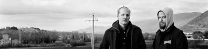
I'd be interested in seeing the picture in the first one flipped. Meaning the person would be on the right side of the banner. I think the Mt's and water would contrast against the logo nicely. Just a friendly suggestion. Cheers.
I'd be interested in seeing the picture in the first one flipped. Meaning the person would be on the right side of the banner. I think the Mt's and water would contrast against the logo nicely. Just a friendly suggestion. Cheers.
I'd be interested in seeing the picture in the first one flipped. Meaning the person would be on the right side of the banner. I think the Mt's and water would contrast against the logo nicely. Just a friendly suggestion. Cheers.
Thanks very much! You just made my day actually
OK - as requested. Out of interest, this was taken at Loch Lomond in Scotland.
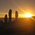
and just for my own amusement one other that I didn't submit as an entry. This was taken at around 1AM near John O'Groats in the far North of Scotland. It didn't actually get any darker than this all night, which was quite surreal..
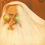
polar sky wrote:I used a 1984 Kodak Fisher Price 110 Film Camera using 110 film. And a Dollar Store Camera with 35 mm expired film. The grain comes from the dust and the hairs that is in the housing of the camera that get trapped on the film, the light leaks are from it being a plastic camera.
This is the one I use:
oh man, I had one of these! I totally forgot about it until now, but man that thing was awesome when I was a kid. Photography seemed so mysterious back then...
Mexicola wrote: and just for my own amusement one other that I didn't submit as an entry. This was taken at around 1AM near John O'Groats in the far North of Scotland. It didn't actually get any darker than this all night, which was quite surreal..
nice! my favorite part of the day. just after sunset.
I really like how this contest has come out. It was a great idea to have the template available so that those of us that aren't graphic designers can contribute. All these cool photos makes me want to contribute some of my own, hopefully I'll have some time over the holiday weekend...
Hey guys, I just stumbled across this topic/site while I was looking for a random piece of BOC info. The idea of a BOC logo/banner contest is awesome! I'm a designer living in Australia and will definitely have a crack. I read the first few pages of this thread then skipped to the last few (too many other pages and not enough time). It looks like the logo has already been decided on, (the BOC within hex reversed with pages in white). Is this the case? Or is the actual logo component still open for suggestion? I hope it is! I think we can do a much better type treatment than that! (no offense to who ever did it though).
I thought I'd have a quick crack anyway. I was aiming for mood above everything else here. Type is pretty basic – needs a bit more work. The actual logo "symbol" is a "b" and a "p" constructed out of hexagonal shapes.
Thoughts anyone? Is the direction okay?
BTW I was listening to Corsair while I put this together.
bananaoctopus wrote:I thought I'd have a quick crack anyway. I was aiming for mood above everything else here. Type is pretty basic – needs a bit more work. The actual logo "symbol" is a "b" and a "p" constructed out of hexagonal shapes.
Thoughts anyone? Is the direction okay?
BTW I was listening to Corsair while I put this together.
I should have made it more clear in this thread, but the contest has moved to stage two a couple of weeks ago. Read all about that over here: http://bocpages.org/wiki/bocpages:Skins#Info (it has been mentioned on the bocpages news snippet though for the last couple of weeks)
You've still got time to submit some work!
BTW, the thing you created looks nice, but unfortunately that part of the contest is over.
PS: This contest is not for twoism.org but for the unofficial boards of canada wiki bocpages.org
bananaoctopus wrote:I thought I'd have a quick crack anyway. I was aiming for mood above everything else here. Type is pretty basic – needs a bit more work. The actual logo "symbol" is a "b" and a "p" constructed out of hexagonal shapes.
Thoughts anyone? Is the direction okay?
BTW I was listening to Corsair while I put this together.
Just on top of Fredd-E's comments, for anyone else making banners... I give my awesome-approval to that ripped-sticker effect at the edges of this one. totally awesome Like an old sticker on an even older backpack or summink...
pretty cool! i think it looks more modern than old. i like stand alone film photos more, they feel more nostalgic. minimal is better in my opinion. still cool though!
bananaoctopus wrote:I thought I'd have a quick crack anyway. I was aiming for mood above everything else here. Type is pretty basic – needs a bit more work. The actual logo "symbol" is a "b" and a "p" constructed out of hexagonal shapes.
Thoughts anyone? Is the direction okay?
BTW I was listening to Corsair while I put this together.
Just on top of Fredd-E's comments, for anyone else making banners... I give my awesome-approval to that ripped-sticker effect at the edges of this one. totally awesome Like an old sticker on an even older backpack or summink...
hey, its too late because the contest is now at stage two