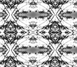
Geogaddi for me. Not just because I love the artwork, the detail, the colour schemes, but also because I feel it perfectly compliments the music of the album.
salamander wrote:Geogaddi for me. Not just because I love the artwork, the detail, the colour schemes, but also because I feel it perfectly compliments the music of the album.
For me it's Music Has the Right to Children, partly because I'm pretty sure the location is the Icefields Parkway in Canada, which my wife and I drove down during our honeymoon. In fact we may have stopped at the very place.
Not sure of there's 'official' confirmation of where the album cover location is?
Play by Numbers. The reflection of the numbers in the child's eyes as if he or she was utterly transfixed at the enormity of a mathematical epiphany he or she's mind is too young to fully comprehend.
Twoism has the coolest of all the album art but I also really like in a beautiful place out in the country and geogaddi. I absolutely adore the font on the campfire headphase though too.
For some reason, Geogaddi's artwork just does nothing for me and if I'm honest neither does Tomorrow's Harvest's.
MHTRTC and Campfire are such amazing visual representations of the sound contained within the album and BoC's sound in general. MHTRTC is my favourite but TCH is a close second. I also like Trans Canada and IABP.
I love MHTRTC's sleeve most of all! I don't know of any other album art (by anyone) that suits the music it contains so well.
But I must say TH's cover has grown on me enormously since I realised I could see thru the city. It sums up the albums philosophy very succinctly