A little confused as to who did the artwork for the album. Neil Krug has the single artwork listed on his site but the album artwork is purportedly by Mike and Marcus. Someone mentioned elsewhere that the Warp guy at Lake Dolores told him the brothers hadn't visited that part of the world. Do you think they just made the artwork using Krugs pics? I really hope M+M did it, as it means a lot more to me if they did... What does everyone think?
Sorry for the rambling post by the way...
Artwork (Tomorrow's Harvest)
Moderators: Aesthetics, Drones, Hexagon Sun
-
newclearmember
- New Seed
- Posts: 8
- Joined: Wed Nov 30, 2011 9:20 am
-
newclearmember
- New Seed
- Posts: 8
- Joined: Wed Nov 30, 2011 9:20 am

I like it too. It's far more subtle than previous art, but like the album itself it seeps into your bloodstream slowly. I think you need to familiarise with the innersleeve/booklet pics aswell in order to appreciate the unsettling mood it inspires.
I would guess they did the sleeve themselves, as Krug's work tends to be more processed - infact more like their older album covers.
I would guess they did the sleeve themselves, as Krug's work tends to be more processed - infact more like their older album covers.
-
thepastinsidepressant

- Sherbet Head
- Posts: 957
- Joined: Sun Jan 27, 2013 2:39 am
- Location: the past
its hard to know with this, what appears to be almost random selection of photos (though i'm sure they thought about what they were selecting) of the inner sleeve shots, are very very like images that would come under "environmental concerns stock photos" i've had a few of these from late 80s, early to mid 90s over the years working as a designer. unless one did a reverse google image search it might show up something. they remind of ABPOITC slides, they appear random, don't hold anything amazing, not perfectly composed crops, just more to do with mood. some don't come under "environmental concerns stock photos", theres a few images there with 'people'.
i don't mind it, a little overdone maybe i.e so many curved edge slides (18?) but i like how they're gridded out, theres some variation there.
i love the back cover though, thats the King for me. not mad on the front cover, granted it has the 80s film vibe thing but...
film directing/editing has many tried and tested tricks. we all have experienced the 'drama, suspense etc' when the enemy/villain arrives on the scene using the shot of 'feet first'. that image of the 'military boot' suggests this to me.
i don't mind it, a little overdone maybe i.e so many curved edge slides (18?) but i like how they're gridded out, theres some variation there.
i love the back cover though, thats the King for me. not mad on the front cover, granted it has the 80s film vibe thing but...
film directing/editing has many tried and tested tricks. we all have experienced the 'drama, suspense etc' when the enemy/villain arrives on the scene using the shot of 'feet first'. that image of the 'military boot' suggests this to me.
Last edited by thepastinsidepressant on Sat Jun 08, 2013 3:24 pm, edited 1 time in total.
-
thepastinsidepressant
- Sherbet Head
- Posts: 957
- Joined: Sun Jan 27, 2013 2:39 am
- Location: the past

-
WeHadNormality
- Dayvan Cowboy
- Posts: 1023
- Joined: Fri Apr 26, 2013 3:02 am
- Location: Pareidolia
In the booklet we have pictures with A, G, and 822. I Googled AG 822 and found this
http://www.unis.no/STUDIes/Arctic_Geology/ag_822.htm. Any thoughts??
Also Googling just 822 produced this
https://www.gov.uk/government/publicati ... and-skills
http://www.unis.no/STUDIes/Arctic_Geology/ag_822.htm. Any thoughts??
Also Googling just 822 produced this
https://www.gov.uk/government/publicati ... and-skills
The Tomorrow's Harvest font is the same one used on an original poster for the 1973 sci-fi film Soylent Green. Could be a modified version of Avant Gard or Quicksans Accurate Fill (ICG font)
http://4.bp.blogspot.com/_v0fV15P7uQo/T ... en_6SH.jpg
http://4.bp.blogspot.com/_v0fV15P7uQo/T ... en_6SH.jpg
-
PlacentaSand

- Eagle Minded
- Posts: 382
- Joined: Wed Dec 21, 2011 5:53 am
- Location: Oakland, CA
-
WeHadNormality
- Dayvan Cowboy
- Posts: 1023
- Joined: Fri Apr 26, 2013 3:02 am
- Location: Pareidolia




Nice image overlay of pages 6 and 7 of the booklet resulting from the paper transparency…
http://i.imgur.com/SPp8yPG.jpg
http://i.imgur.com/SPp8yPG.jpg
Last edited by purgruv on Tue Jun 18, 2013 3:41 pm, edited 1 time in total.


purgruv wrote:Nice image overlay of pages 6 and 7 of the booklet resulting from the paper transparency…
http://i.imgur.com/SPp8yPG.jpg
are there more of these? I'd love some high-res scans of the art-card thingies
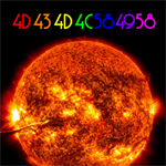


mc10101 wrote:In the booklet we have pictures with A, G, and 822. I Googled AG 822 and found this
http://www.unis.no/STUDIes/Arctic_Geology/ag_822.htm. Any thoughts??
Also Googling just 822 produced this
https://www.gov.uk/government/publicati ... and-skills
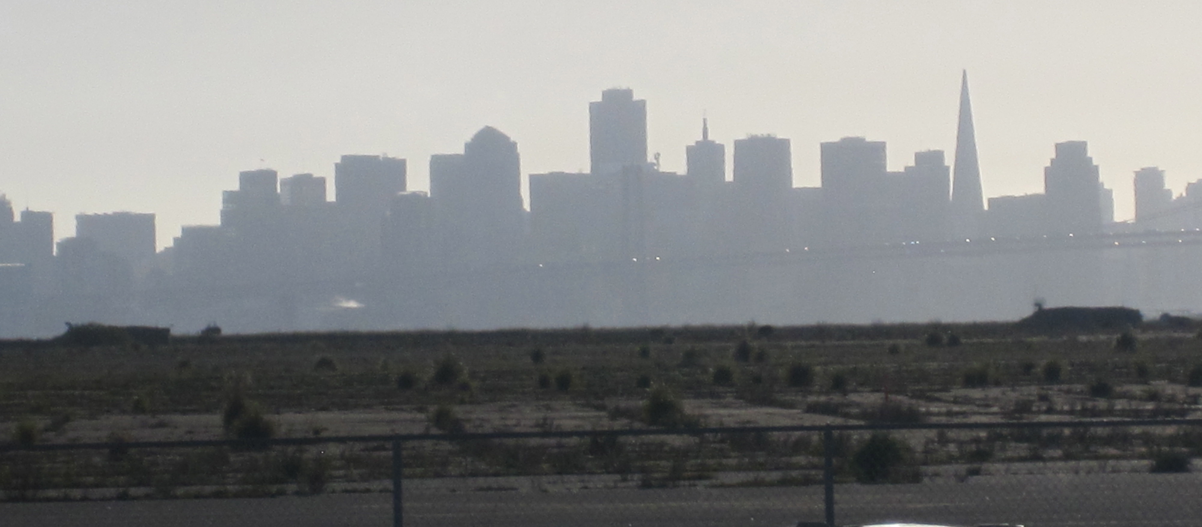
A compilation of the results of a superficial Google image search...

Although not a follower of Nosnam Selrahc, he was a devoted family member.