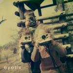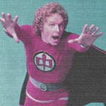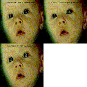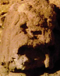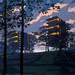
Rodheh wrote:I'm still liking this the best, but it has some sort of strange sharpness to it. Is that a product of scaling the image down or something?
Trying to think whether the front would be better with the saturation down just a tad or the colors left up.
I like it a lot, it stands out very differently from all of the covers we have had.
Thanks again, I've no real idea what I'm doing, so everything's a product of just messing around. I just played with the images in iPhoto before adjusting colours and other stuff in GIMP. The sharpness comes mainly from just upping the sharpness, definition, contrast and saturation settings.
I did wonder as well whether the font colours were too strong, but I think it's sort of needed for the theme to work.