One on Twoism - Volume 6 [Artwork Poll]
Moderator: Aesthetics
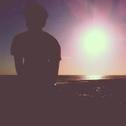
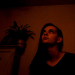

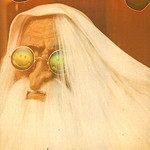
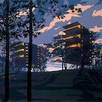
Dudeman162 wrote:Yes, but long shadow artwork is the only one that doesn't have the generic nature artwork all the others have. I'm not undermining anyone's work here, for they're all awesome, but the nature theme has been overdone.[/list]powershoes wrote:Dudeman162 wrote:Is that not the point? To be inspired by Boards of Canada, everyone's favorite band on these forums?MrMessiah wrote:I was torn between LongShadows and DaveJ. Voted DaveJ in the end, cos even though I *love* LongShadows design, I can't help feel like the hexagons, the 666 and everything, is sort of BoC's symbols, you know?
to be inspired is one thing, overt usage of boc symbolism is another thing entirely.
don't get me wrong, longshadows' design is awesome on its own. i feel that davej's design best fits in with the oot series as a whole.
Why didn't you submit something then?

jcnporter wrote:polar sky wrote:I still wanna know what book/vintage poster perch stole those images from. As he would need to credit the original artist.
I think he said that his friend did them using a scanner or something?
Oh, I think they look cool! I just want to know where he got the images as they are already someone else's (vintage space poster/book cover) obviously.
polar sky wrote:jcnporter wrote:polar sky wrote:I still wanna know what book/vintage poster perch stole those images from. As he would need to credit the original artist.
I think he said that his friend did them using a scanner or something?
Oh, I think they look cool! I just want to know where he got the images as they are already someone else's (vintage space poster/book cover) obviously.
It was a sort of combined effort, My friend paul did the raw photography/scanning, and I did the digital manipulation/layout bit. I can have him sign in and confirm if that would make you guys more comfortable
edit* also to clarify, the image was made with actual smoke, liquid, and lights, no scanning of a pre-made image or anything like that (I can't tell if that was the question
 )
)-
Distant Nebulus
- Sherbet Head
- Posts: 509
- Joined: Sun Jun 13, 2010 11:32 pm
- Location: MN

-
paylmowtin
- New Seed
- Posts: 1
- Joined: Fri Apr 11, 2014 2:46 pm
- Location: Milwaukee
Hey this is Paul, I made the images in Perch's design. They were made using smoke blown onto the surface of a scanner and a small amount of water in a dish. You can view others here https://www.flickr.com/photos/ohboyohbo ... 830070584/
I have a lot more images and videos like this so feel free to check more out if you are so inclined. http://cargocollective.com/paulrabe
Perch is a good friend of mine and collaborator in videos and music. Thank you all for the support of his design. It was his idea to create it and I'm honored that he chose my work. All the designs are very interesting and I wish luck to all of them. Glad to be a part of this.
-paylmowtin
I have a lot more images and videos like this so feel free to check more out if you are so inclined. http://cargocollective.com/paulrabe
Perch is a good friend of mine and collaborator in videos and music. Thank you all for the support of his design. It was his idea to create it and I'm honored that he chose my work. All the designs are very interesting and I wish luck to all of them. Glad to be a part of this.
-paylmowtin
-
Synthestesia
- Dayvan Cowboy
- Posts: 1721
- Joined: Sun Aug 16, 2009 11:31 pm
- Location: the place
- Contact:


Okay, about long shadow's image - no, it's not the generic nature thing. However, there are two here that are not the generic nature thing (and the other one has a cover that looks like it jumped out of the 70's and an insert that reminds me of Downward Spiral artwork) and one that does involve nature is much sharper and different than the kind we've used before. There have been designs like his before, and granted it's different in terms of a OOT submission (and that's good IMO), acting as though it's the only one that "isn't generic" is looking at the rest in a really shallow way. I only see two glaringly "generic" entries here and that's only because they were both submitted by different artists and unfortunately ended up right next to each other.
Anyways, I'm not going to announce or highlight my vote. One that I liked a lot did not end up exactly how I had hoped it would, mainly because of the font. Also a little bit appalled it has received as few votes as it has. However, two other covers are just as much of favorites with the RGB one also being interesting. Loved three, and then after thinking, the final choice became clear. Mainly, I hoped to vote for something that was the most different from anything we've had already. That strays the most from the same sort of font we've used, strays the most from usage of clouds, water, wildlife, etc. The least BoC-like despite this being the One on Twoism compilation, simply because looking at each edition lined up makes me feel like we need a good combo breaker in terms of artwork. It won't be anything negative because all of the art here is good, including that which is different than OOT has had before. I'd also wanted to vote for something particularly dark. I will admit that part of this is probably because the selection of tracks that are used on the compilation will be congruent with the artwork and some of us went kind of dark for this comp. There were two main ones that fit the dark thing and one that could if the lighting were different. However, one of which I still think looks great on its own and would have been my choice earlier is no longer my choice in its finished version. I think someone said that it looked "best fitting with the series as a whole" - while I don't agree with that comment about that particular cover because it's fairly (not tremendously) different, that's exactly what I think people should vote against. I think a completely new style for each edition works the best and distances the compilation from BoC somewhat - we already create music that is often reminiscent of their work for these compilations, and having similar artwork for each comp. just how BoC tends to have some sort of saturated, one or two basic color scheme on their releases with faceless people (three releases in a row discounting IABPOITC) makes it a bit too similar.
Anyways, I'm not going to announce or highlight my vote. One that I liked a lot did not end up exactly how I had hoped it would, mainly because of the font. Also a little bit appalled it has received as few votes as it has. However, two other covers are just as much of favorites with the RGB one also being interesting. Loved three, and then after thinking, the final choice became clear. Mainly, I hoped to vote for something that was the most different from anything we've had already. That strays the most from the same sort of font we've used, strays the most from usage of clouds, water, wildlife, etc. The least BoC-like despite this being the One on Twoism compilation, simply because looking at each edition lined up makes me feel like we need a good combo breaker in terms of artwork. It won't be anything negative because all of the art here is good, including that which is different than OOT has had before. I'd also wanted to vote for something particularly dark. I will admit that part of this is probably because the selection of tracks that are used on the compilation will be congruent with the artwork and some of us went kind of dark for this comp. There were two main ones that fit the dark thing and one that could if the lighting were different. However, one of which I still think looks great on its own and would have been my choice earlier is no longer my choice in its finished version. I think someone said that it looked "best fitting with the series as a whole" - while I don't agree with that comment about that particular cover because it's fairly (not tremendously) different, that's exactly what I think people should vote against. I think a completely new style for each edition works the best and distances the compilation from BoC somewhat - we already create music that is often reminiscent of their work for these compilations, and having similar artwork for each comp. just how BoC tends to have some sort of saturated, one or two basic color scheme on their releases with faceless people (three releases in a row discounting IABPOITC) makes it a bit too similar.
Okay...now...wait for fog machine.


paylmowtin wrote:Hey this is Paul, I made the images in Perch's design. They were made using smoke blown onto the surface of a scanner and a small amount of water in a dish. You can view others here https://www.flickr.com/photos/ohboyohbo ... 830070584/
I have a lot more images and videos like this so feel free to check more out if you are so inclined. http://cargocollective.com/paulrabe
Perch is a good friend of mine and collaborator in videos and music. Thank you all for the support of his design. It was his idea to create it and I'm honored that he chose my work. All the designs are very interesting and I wish luck to all of them. Glad to be a part of this.
-paylmowtin
Fantastic! You did a great job! Very cool work.
-
Waterbagel

- Dayvan Cowboy
- Posts: 1953
- Joined: Sun Aug 09, 2009 12:50 am
- Location: gulf coast US
Seriously probably the hardest decision I've made all week. Something about reading how Perch's design was made (kudos to paul) tipped me over to that one in the end. Loved DaveJ's and Long's too, though.
Props to polar_sky and rotane, too. Very clean, pretty album covers. They'd be beautiful artwork for an album and I'd likely buy it in a heartbeat.
Just.. A+, all around
Props to polar_sky and rotane, too. Very clean, pretty album covers. They'd be beautiful artwork for an album and I'd likely buy it in a heartbeat.
Just.. A+, all around
-
Dudeman162

- Posts Quantity
- Posts: 132
- Joined: Wed Oct 16, 2013 7:31 am
Because I don't know how to art.polar sky wrote:Dudeman162 wrote:Yes, but long shadow artwork is the only one that doesn't have the generic nature artwork all the others have. I'm not undermining anyone's work here, for they're all awesome, but the nature theme has been overdone.[/list]powershoes wrote:Dudeman162 wrote:Is that not the point? To be inspired by Boards of Canada, everyone's favorite band on these forums?MrMessiah wrote:I was torn between LongShadows and DaveJ. Voted DaveJ in the end, cos even though I *love* LongShadows design, I can't help feel like the hexagons, the 666 and everything, is sort of BoC's symbols, you know?
to be inspired is one thing, overt usage of boc symbolism is another thing entirely.
don't get me wrong, longshadows' design is awesome on its own. i feel that davej's design best fits in with the oot series as a whole.
Why didn't you submit something then?


Waterbagel wrote:Props to polar_sky and rotane, too. Very clean, pretty album covers. They'd be beautiful artwork for an album and I'd likely buy it in a heartbeat.
Just.. A+, all around
Yeah I agree with you there. Reading the submission thread was cool because just when you think you've chosen a design, another brilliant one got posted. Edit: if Aesthetics had managed to get rights to the tunnel world pictures it would have been even harder too.
-
circleofthesun
- Eagle Minded
- Posts: 262
- Joined: Sun Jan 13, 2013 6:16 pm
- Location: Don't you know, I've left and gone away?
- Contact: