I'd lose the left hand side rectangle. It would turn into a big blob on a tattoo and lends nothing to the overall design. Then centre the text either smaller or on 2 lines under the trees. :)
Still seriously considering to get a tat. Here's a mockup of a few ideas I had - bear in mind that it was done with Paint and I'm no designer at all. I cannot seem to pick one out of the 4, although they're quite similar...
i have a little hexagon on the back of my leg just above my ankle as my little BoC tribute and i really love it even though it's so simple. it always sits just above the top of my shoe.
really bad grainy picture but you get the idea
i actually am thinking of changing it into a cube though, and getting the other platonic solids on my other ankle, wrists and the back of my neck (one of them on each of these spots). so if i do that, i may someday put a clearer boards of canada reference somewhere on my body.
Last edited by uf0party on Sun Apr 20, 2014 9:32 pm, edited 1 time in total.
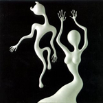
DaveJ wrote:Got the etching from Geogaddi done a while back on my wrist, while in getting another tattoo filled in.
nice! i like that a lot
Cheers man, wanted a BoC tattoo but not the logo or a hexagon. The guy took the liberty of making the woman look a bit more 'feminine' than on the actual etching But I'm happy with it none the less.
DaveJ wrote:Cheers man, wanted a BoC tattoo but not the logo or a hexagon. The guy took the liberty of making the woman look a bit more 'feminine' than on the actual etching But I'm happy with it none the less.
hah yea i myself probably would've left it how it originally was, i actually like the androgyny of the figures, but it is still a cool tattoo.
DaveJ wrote:Cheers man, wanted a BoC tattoo but not the logo or a hexagon. The guy took the liberty of making the woman look a bit more 'feminine' than on the actual etching But I'm happy with it none the less.
hah yea i myself probably would've left it how it originally was, i actually like the androgyny of the figures, but it is still a cool tattoo.
Yeah man, he didn't even ask ha, but I honestly don't mind, may have looked like two guys otherwise, but would prefer if he stuck to the template. Just got it done quick after getting a larger one filled in. Not a big fan of the logo, so it's hard to think of a somewhat original and cool BoC tattoo.
wow! that came out quite nice looking! Very jealous. Ive been thinking for years about getting that design as well
I dont have much tattoo knowledge, but I have a feeling that turquoise and other light / bright colors would fade pretty noticeably to the person tattooed. Am I way off here? Thats really the only thing keeping me from choosing turquoise as the color of the center hexagon
"We're just a band. Not an IDM band, not an electronic band, and not a dance band."
"An imaginary road trip in a rusty pick-up heading west through the brain"
wow! that came out quite nice looking! Very jealous
I dont have any tattoo knowledge, but I have a feeling that turquoise and other light / bright colors would fade pretty noticeably to the person tattooed. Am I way off here?
yeah, darker ink lasts longer without fading, as far as I know. But, unfortunately all fade somewhat and may need to be re-touched. But can look nice faded a bit too! But closer to skin tone, seems to fade a lot faster, in my experience anyway.



 But I'm happy with it none the less.


 I am going to start saying that now.