Inferno Artsyle Discussion
Moderators: Aesthetics, Drones, Hexagon Sun

Inferno Artsyle Discussion
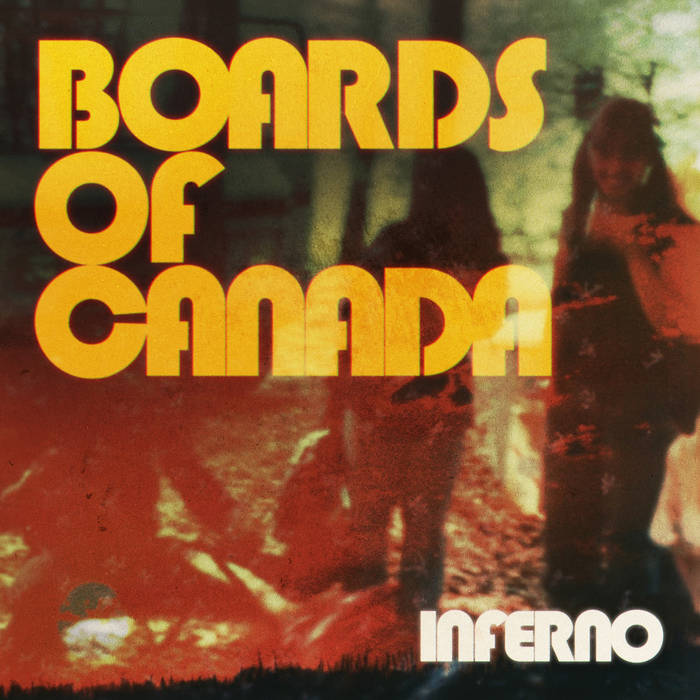
the artstyle behind the new LP Inferno seems to be a bit polarizing. some think its too obvious with itself, others think its just right. what are your thoughts behind the artstyle? if you think it fits, how so? if you have gripes with it or are mxied, why? how specifically about the new artstyle do you guys feel?
-
Altruizine

- Eagle Minded
- Posts: 309
- Joined: Tue Nov 10, 2009 5:51 pm
Re: Inferno Artsyle Discussion
It’s not the worst but feels slightly ”cheap”. Geogaddi has such good cover art. All the other covers are more ”premium” looking which is strange because this is over 20 years older than most of them
With the gravitas the BoC name has it’d be awesome to see something more iconic and ”pro artsy” with the name slapped on it
With the gravitas the BoC name has it’d be awesome to see something more iconic and ”pro artsy” with the name slapped on it

Re: Inferno Artsyle Discussion
I love it. Its a side we haven't seen this playful side from them since some of the old tunes. Feels more self-aware and personal, without becoming too cheeky or satirizing. Dig it. I am so stocked!
Throw away your smartphone.

Re: Inferno Artsyle Discussion
I personally love it, I love the chunky type and the video nasty/disaster film colour palette, the acid burned photos and general feeling of toxicity and horror but with a hint of cinematic sexiness, I totally see why they chose to work with Neil Krug, he's Boards on acid and I for one love the aesthetic.
-
Altruizine
- Eagle Minded
- Posts: 309
- Joined: Tue Nov 10, 2009 5:51 pm
Re: Inferno Artsyle Discussion
Btw it’s a good idea to include the artwork in the thread about it. I considered saying this or even doing it myself but I was on mobile and wondered if I’m just being some stickler. Now I actually wanted to look at it and would’ve been convenient to have it here and not buried in the long thread. I’m still on mobile but eh whatever. Could have the rest too tho. I hope hotlinking Bandcamp is sustainable

Re: Inferno Artsyle Discussion
It seems it's not Neil Krug, but Robert Beatty:Wildfire wrote:I personally love it, I love the chunky type and the video nasty/disaster film colour palette, the acid burned photos and general feeling of toxicity and horror but with a hint of cinematic sexiness, I totally see why they chose to work with Neil Krug, he's Boards on acid and I for one love the aesthetic.

Re: Inferno Artsyle Discussion
Late Night With The Devil vibes
Re: Inferno Artsyle Discussion
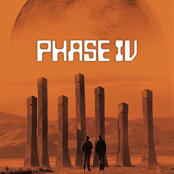
I've seen "Phase IV" mentioned
-
belchmaster

- Posts Quantity
- Posts: 236
- Joined: Wed Oct 07, 2020 5:37 pm
Re: Inferno Artsyle Discussion
Its a bit "meh" for me personally. I don't get the huge ass font. Feels a bit like a merge of all the covers mashed into one. The videos are on point though. Really liking those.
-
Radiobuzz
- Eagle Minded
- Posts: 381
- Joined: Wed Sep 03, 2008 4:20 am
- Location: On a beach in Argentina
Re: Inferno Artsyle Discussion
I do like it but I agree it's very different from previous albums. The posters were very b-horror movie style and the aesthetic of the album seem to be going in that direction, which is different for sure but not bad to me. I guess it feels more like a Hell Interface thing than a BoC thing... but it's the same thing at the end soooo
---
Fuck transphobes
Fuck transphobes
Re: Inferno Artsyle Discussion
it'is kinda reminding me of KendrickLamar's "DAMN" album artwork.
i.e., unsubtle, kind of 'ugly' in a way, which ultimately signified that the sound of the album was somewhat blown out, over-the-top, etc.
unsure if the artwork here suggests a similar sonic approach, but personally I am into it but slightly confused. like, the proportioning and placement of things feels incongruous.
but then again (call it "copium" if you must) I am eager to go along for the ride and have my artistic preconceptions challenged. I kind'of find it exciting when artists release album art/information and a large portion of the fans are miffed by it. I find that moment of discomfort generative.
i.e., unsubtle, kind of 'ugly' in a way, which ultimately signified that the sound of the album was somewhat blown out, over-the-top, etc.
unsure if the artwork here suggests a similar sonic approach, but personally I am into it but slightly confused. like, the proportioning and placement of things feels incongruous.
but then again (call it "copium" if you must) I am eager to go along for the ride and have my artistic preconceptions challenged. I kind'of find it exciting when artists release album art/information and a large portion of the fans are miffed by it. I find that moment of discomfort generative.
"Fall in love with some activity, and do it! Nobody ever figures out what life is all about, and it doesn't matter. Explore the world. Nearly everything is really interesting if you go into it deeply enough." - Richard P. Feynman
-
Quadrivium
- Posts Quantity
- Posts: 191
- Joined: Fri Jul 30, 2021 8:04 am
- Location: Europa
Re: Inferno Artsyle Discussion
Really on the fence here. This feels different. It is much more on the nose, almost like they are leaning into the exact image they used to sidestep. Instead of suggestion, it feels like presentation, and that shift kind of breaks the spell for me.
I am also honestly surprised and a bit disappointed to see the limited edition coloured vinyl rollout. It feels very fomo driven and a bit too aligned with consumerist hype, which is not something I would have associated with them before.
Maybe it will make more sense in the context of the full album, but right now it borders on self parody in a way I did not expect from them.
I am also honestly surprised and a bit disappointed to see the limited edition coloured vinyl rollout. It feels very fomo driven and a bit too aligned with consumerist hype, which is not something I would have associated with them before.
Maybe it will make more sense in the context of the full album, but right now it borders on self parody in a way I did not expect from them.
1986 Summer Fire
-
Altruizine
- Eagle Minded
- Posts: 309
- Joined: Tue Nov 10, 2009 5:51 pm
Re: Inferno Artsyle Discussion
The font isn’t just huge but the spacing is awkward and the letters are borderline sticking to each other. It could be some cool stylistic choice to create a cramped or claustrophobic feeling… but it doesn’t feel like it and just looks like lousy design. Kinda expecting to see fanmade alternative covers that I’ll actually prefer. Someone even made a really stylish video about spinning 3d models of the effin cassettes around…
-
soupbandit
- Posts Quantity
- Posts: 134
- Joined: Wed Oct 11, 2006 5:20 am
Re: Inferno Artsyle Discussion
I get the impression that krug/warp helped with TH art but with this one they did all the static art themselves again. The videos being Beatty? That's just my hunch.
Since all of the LPs have a distinct colorway I think the yellow font and size of that font was an effort to push it that way...towards a yellow cover scheme.
About it being different I think there's something nice about a 'release' from, what to me, felt like maybe they were commercially supposed to keep doing with the covers but I don't know.
Since all of the LPs have a distinct colorway I think the yellow font and size of that font was an effort to push it that way...towards a yellow cover scheme.
About it being different I think there's something nice about a 'release' from, what to me, felt like maybe they were commercially supposed to keep doing with the covers but I don't know.
Last edited by soupbandit on Wed Apr 22, 2026 7:56 pm, edited 1 time in total.
-
Altruizine
- Eagle Minded
- Posts: 309
- Joined: Tue Nov 10, 2009 5:51 pm
Re: Inferno Artsyle Discussion
What are those people on the cover even doing? Standing around looking impy? If they took a random family photo again and tried to stage it as being ”sinister” that’s a bit corny. At first I wondered if there was someone lying on the ground in front of them. Imagine a BoC cover pic about someone getting their ass kicked
-
soupbandit
- Posts Quantity
- Posts: 134
- Joined: Wed Oct 11, 2006 5:20 am
Re: Inferno Artsyle Discussion
^^^ lol. I think it's two kids (one girl) and an obscure person working on a campfire with a forest overlay. forest fires? climate change? camping trips as kids?
Last edited by soupbandit on Wed Apr 22, 2026 8:00 pm, edited 1 time in total.
Re: Inferno Artsyle Discussion
This was probably Warp's doing. Also, it's only a tenner more and there's probably thousands of them. Not a big deal imo.Quadrivium wrote:I am also honestly surprised and a bit disappointed to see the limited edition coloured vinyl rollout. It feels very fomo driven and a bit too aligned with consumerist hype, which is not something I would have associated with them before.
Last edited by fujee on Wed Apr 22, 2026 8:00 pm, edited 1 time in total.
Sagan: In order to make an apple pie from scratch, you must first invent the universe.
Basinski: I wanted Cascade to become this crystalline organism like a star or a liquid crystal spaceship, a jellyfish traveling through the galaxy…
Basinski: I wanted Cascade to become this crystalline organism like a star or a liquid crystal spaceship, a jellyfish traveling through the galaxy…
Re: Inferno Artsyle Discussion
Well I'll be the son of an onion. Would you look at that.outhudd wrote:It seems it's not Neil Krug, but Robert Beatty:Wildfire wrote:I personally love it, I love the chunky type and the video nasty/disaster film colour palette, the acid burned photos and general feeling of toxicity and horror but with a hint of cinematic sexiness, I totally see why they chose to work with Neil Krug, he's Boards on acid and I for one love the aesthetic.
-
johnstamos
- Friendly Stranger
- Posts: 10
- Joined: Mon May 31, 2021 12:03 am
Re: Inferno Artsyle Discussion
Not too big on it at the moment. It looks sort of like a fan made art for a fan made compilation.
That said - I haven't heard the album and it could fit the album perfectly. So who knows.
That said - I haven't heard the album and it could fit the album perfectly. So who knows.
Re: Inferno Artsyle Discussion
i do agree the general vibe is a bit crude, but reusing family photos is boards of canada's thing man. They've been doing that since their old tunes.Altruizine wrote:What are those people on the cover even doing? Standing around looking impy? If they took a random family photo again and tried to stage it as being ”sinister” that’s a bit corny. At first I wondered if there was someone lying on the ground in front of them. Imagine a BoC cover pic about someone getting their ass kicked
"Boc is probably in the future thinking about the past" - Sean Booth 05/06/2022