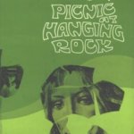
I love it, it feels very 70s cultish or giallo style. I do think the font/lettering is the most bold choice but I think it fits the aesthetic it's going for.
Anyways, it's all about the tunes for me. If Geogaddi wasn't so godamn perfect I wonder if people would feel differently about that album art.
Inferno Artsyle Discussion
Moderators: Aesthetics, Drones, Hexagon Sun
-
magrathea_ultima

- Posts Quantity
- Posts: 145
- Joined: Fri Jul 11, 2025 2:48 pm
Re: Inferno Artsyle Discussion
I agree, some of the overlaying looks very dated, perhaps it is on purpose, who knows.johnstamos wrote:Not too big on it at the moment. It looks sort of like a fan made art for a fan made compilation.
That said - I haven't heard the album and it could fit the album perfectly. So who knows.
"People who think they know everything are a great annoyance to those of us who do" -Isaac Asimov

Re: Inferno Artsyle Discussion
I agree, that’s label business. I prefer the black vinyl, but CDs are my favorite.fujee wrote:This was probably Warp's doing. Also, it's only a tenner more and there's probably thousands of them. Not a big deal imo.Quadrivium wrote:I am also honestly surprised and a bit disappointed to see the limited edition coloured vinyl rollout. It feels very fomo driven and a bit too aligned with consumerist hype, which is not something I would have associated with them before.
Re: Inferno Artsyle Discussion
We do have sky blue IABPOITC and white TCH...? If there were more than one variant I would be upset. But, there's not.Den wrote:I agree, that’s label business. I prefer the black vinyl, but CDs are my favorite.fujee wrote:This was probably Warp's doing. Also, it's only a tenner more and there's probably thousands of them. Not a big deal imo.Quadrivium wrote:I am also honestly surprised and a bit disappointed to see the limited edition coloured vinyl rollout. It feels very fomo driven and a bit too aligned with consumerist hype, which is not something I would have associated with them before.
The big font makes me think someone at the label said "we gotta have something on the cover that makes the layman go 'WOW I REMEMBER THAT BAND'" But, as others have pointed out, the aesthetic of this record is very 70's B-Horror movie, so it all feels right to me.
My knee-jerk reaction was that it was clunky. But, sitting with it all day I really like it. It's all such a departure from the typical for them and I appreciate that.
The Baddest Alt Electronic Pop Music: Twenty20k.comBiznasty wrote:off to the pub... /// --- ..-. ..-. / - --- / - .... . / .--. ..- -... .-.-.- .-.-.- .-.-.-
How BOC feels about: Censorship | Environment | The World | A New Album
-
Redd Panderson

- Eagle Minded
- Posts: 295
- Joined: Fri Apr 10, 2026 12:36 pm
Re: Inferno Artsyle Discussion
Bringing in an idea I brought up in the general Inferno thread because it applies to the cover. It has to do with the idea of our past, present, and future selves being contained in this one moment and how parts of ourselves get frozen in the past.
It involves behavioral loops that get stuck on repeat in our psyches as we age and continue to manifest as similar situations in our lives over and over. It's like the negative edge of nostalgia. Not necessarily trauma, but the momentum of habit that we are often blind to while ending up in the same difficult situations time and again.
Also related to loops: feedback. The closed loop producing monstrous things with exaggerated features in our lives, dreams, and societies, frightening us until we can cultivate enough equanimity to face them head-on. I think that exaggerated, maybe even cartoonish, character of our demons when left unchecked kind of fits with the bit of camp in the design for Inferno.
I already said it somewhere else, but, to me, I'm getting the feeling this isn't strictly a dark album, but also about the process of turning to face your demons--individually and as a society--in order to transcend and move beyond them. To thaw the frozen parts inside. To befriend those exiled aspects of our psyche so we can rescue ourselves from the havoc they can wreak when left unchecked.
So I appreciate the kind of horror, kind of camp look. There's a funhouse mirror yet sinister look and I do think it all has some parallel to what some people call shadow work.
It involves behavioral loops that get stuck on repeat in our psyches as we age and continue to manifest as similar situations in our lives over and over. It's like the negative edge of nostalgia. Not necessarily trauma, but the momentum of habit that we are often blind to while ending up in the same difficult situations time and again.
Also related to loops: feedback. The closed loop producing monstrous things with exaggerated features in our lives, dreams, and societies, frightening us until we can cultivate enough equanimity to face them head-on. I think that exaggerated, maybe even cartoonish, character of our demons when left unchecked kind of fits with the bit of camp in the design for Inferno.
I already said it somewhere else, but, to me, I'm getting the feeling this isn't strictly a dark album, but also about the process of turning to face your demons--individually and as a society--in order to transcend and move beyond them. To thaw the frozen parts inside. To befriend those exiled aspects of our psyche so we can rescue ourselves from the havoc they can wreak when left unchecked.
So I appreciate the kind of horror, kind of camp look. There's a funhouse mirror yet sinister look and I do think it all has some parallel to what some people call shadow work.
Verde Hexagon Hashbrown
Re: Inferno Artsyle Discussion
I feel that.Redd Panderson wrote:Bringing in an idea I brought up in the general Inferno thread because it applies to the cover. It has to do with the idea of our past, present, and future selves being contained in this one moment and how parts of ourselves get frozen in the past.
It involves behavioral loops that get stuck on repeat in our psyches as we age and continue to manifest as similar situations in our lives over and over. It's like the negative edge of nostalgia. Not necessarily trauma, but the momentum of habit that we are often blind to while ending up in the same difficult situations time and again.
Also related to loops: feedback. The closed loop producing monstrous things with exaggerated features in our lives, dreams, and societies, frightening us until we can cultivate enough equanimity to face them head-on. I think that exaggerated, maybe even cartoonish, character of our demons when left unchecked kind of fits with the bit of camp in the design for Inferno.
I already said it somewhere else, but, to me, I'm getting the feeling this isn't strictly a dark album, but also about the process of turning to face your demons--individually and as a society--in order to transcend and move beyond them. To thaw the frozen parts inside.
Also, they’ve always said that they have no interest in making music that is just dark or light, it’s always both, never either/or.
-
MyKneesAreCold

- Friendly Stranger
- Posts: 35
- Joined: Tue Jul 30, 2013 7:01 am
Re: Inferno Artsyle Discussion
My only thoughts on the artwork is that the girl on the right looks like Windowlicker RDJ and the letters are placed awkwardly so that girl is all I really see.
The title, Inferno… meh. I don’t hate it, but it feels strange as a BoC album title maybe? Too on-the-nose? But at the same time I really like how brazen it is, shows strong artistic vision and energy from the brothers which is all I could really hope for. Everything else that we have so far, videos, track titles, merch, etc. are 10/10 so I am stopping myself from thinking too critically about any one detail for now. Could not be more excited, still doesn’t feel real
The title, Inferno… meh. I don’t hate it, but it feels strange as a BoC album title maybe? Too on-the-nose? But at the same time I really like how brazen it is, shows strong artistic vision and energy from the brothers which is all I could really hope for. Everything else that we have so far, videos, track titles, merch, etc. are 10/10 so I am stopping myself from thinking too critically about any one detail for now. Could not be more excited, still doesn’t feel real
Re: Inferno Artsyle Discussion
I agree. I was also looking at the original Campfire Headphase threads and so many of the initial reactions were surprisingly critical. The shift from Geogaddi to Campfire was massive, and Campfire to Tomorrow’s Harvest. The title is perplexing and that’s exciting because I fully trust their artistic vision.MyKneesAreCold wrote: The title, Inferno… meh. I don’t hate it, but it feels strange as a BoC album title maybe? Too on-the-nose? But at the same time I really like how brazen it is, shows strong artistic vision and energy from the brothers which is all I could really hope for. Everything else that we have so far, videos, track titles, merch, etc. are 10/10 so I am stopping myself from thinking too critically about any one detail for now. Could not be more excited, still doesn’t feel real
I keep focusing how the word fern - which is a very BOC plant to me - is inside inferno.
-
Betterthanyourkids

- Eagle Minded
- Posts: 404
- Joined: Mon Apr 29, 2013 4:02 pm
- Location: MPLS
- Contact:
Re: Inferno Artsyle Discussion
On first glance - That text is too damn big. The aesthetic also is very...typical for them in a way I wouldn't expect. There's literally a creepy smiling child on it. It doesn't feel like a strong step forward.
But I also remember many people here (myself included) not being crazy about the Tomorrow's Harvest art when it was first revealed. Not very colorful, buildings on it etc. But then the album dropped, we heard the music, and it fit perfectly. So maybe this album will be bizarre and dramatic in a way that fits this vision. Someone earlier in the thread used the word "brazen" and I think that's a perfect description.
But I also remember many people here (myself included) not being crazy about the Tomorrow's Harvest art when it was first revealed. Not very colorful, buildings on it etc. But then the album dropped, we heard the music, and it fit perfectly. So maybe this album will be bizarre and dramatic in a way that fits this vision. Someone earlier in the thread used the word "brazen" and I think that's a perfect description.
in PACOL
https://pacol.bandcamp.com
https://pacol.bandcamp.com

Re: Inferno Artsyle Discussion
haven't been here in a while.
I agree that at first glance, I wasn't the biggest fan of the cover, but I have high confidence that it will match the sound of the album well - especially after reading the (reportedly) leaked RA description. I've come around to it quite a bit already, especially after seeing the cannibal holocaust comparisons.
The only thing I don't think I will get past is that pic of the girls face, the one used in the promo posters and which appears to be on the sleeve of the standard black vinyl. Everything else looks pretty mint, but that pic just screams cheesy horror movie to me.
I agree that at first glance, I wasn't the biggest fan of the cover, but I have high confidence that it will match the sound of the album well - especially after reading the (reportedly) leaked RA description. I've come around to it quite a bit already, especially after seeing the cannibal holocaust comparisons.
The only thing I don't think I will get past is that pic of the girls face, the one used in the promo posters and which appears to be on the sleeve of the standard black vinyl. Everything else looks pretty mint, but that pic just screams cheesy horror movie to me.
no information at this moment in time
Re: Inferno Artsyle Discussion
Inferno seems starkly unrefined compared to their original 3 LPs, TH was a departure somewhat but inferno is clearly aesthetically from a different place, though it doesn't look bad sitting next to the others, it just doesn't communicate serious composure and taste like this original 3, imo.
The titles of the tracks confers this feeling some more, I kind of wonder if they stopped using psychedelics (I find psychedelics can get you profoundly in touch with really subtle aesthetic choices, which I see in their albums artwork generally but not so much in inferno nor really tomorrows harvest).
The posters looked really good and communicate a strong visual sense, but the album artwork itself kinda seems relative low bar and quickly composed.
They've raised families in the meantime since TCH and I'm sure that takes up a bunch of real estate in ones mental landscape so things outside of family suffer from the lack of sufficient attention, ie art, etc.
It's different and personally it seems to hint at a another LP or EP release, as this can't be it for another 10+ years, thats just the vibe I get from the album artwork.
Super stoked to hear the new album though.
The titles of the tracks confers this feeling some more, I kind of wonder if they stopped using psychedelics (I find psychedelics can get you profoundly in touch with really subtle aesthetic choices, which I see in their albums artwork generally but not so much in inferno nor really tomorrows harvest).
The posters looked really good and communicate a strong visual sense, but the album artwork itself kinda seems relative low bar and quickly composed.
They've raised families in the meantime since TCH and I'm sure that takes up a bunch of real estate in ones mental landscape so things outside of family suffer from the lack of sufficient attention, ie art, etc.
It's different and personally it seems to hint at a another LP or EP release, as this can't be it for another 10+ years, thats just the vibe I get from the album artwork.
Super stoked to hear the new album though.
" if you are reading this you are spending too much time at your computer. go outside and get some fresh air. "
Re: Inferno Artsyle Discussion

" if you are reading this you are spending too much time at your computer. go outside and get some fresh air. "
-
MyKneesAreCold
- Friendly Stranger
- Posts: 35
- Joined: Tue Jul 30, 2013 7:01 am
Re: Inferno Artsyle Discussion
I like the theory that this could be part of a trilogy modeled after the Divine Comedy (Inferno, Purgatorio, Paradiso). The aesthetic shift would make more sense in that context. That seems like wishful thinking though. 70 minutes of new music is incredible, two more full length albums on top of that would be…Wow!shelf wrote:It's different and personally it seems to hint at an another LP or EP release, as this can't be it for another 10+ years, thats just the vibe I get from the album artwork.
Re: Inferno Artsyle Discussion
It's really, not bad.

" if you are reading this you are spending too much time at your computer. go outside and get some fresh air. "
Re: Inferno Artsyle Discussion
2 more LPs seems like a stretch, but it has been 13 years, and they've produced 3 LPs within 13 yers before so who knows.MyKneesAreCold wrote:I like the theory that this could be part of a trilogy modeled after the Divine Comedy (Inferno, Purgatorio, Paradiso). The aesthetic shift would make more sense in that context. That seems like wishful thinking though. 70 minutes of new music is incredible, two more full length albums on top of that would be…Wow!shelf wrote:It's different and personally it seems to hint at an another LP or EP release, as this can't be it for another 10+ years, thats just the vibe I get from the album artwork.
I'm thinking more so, maybe a EP in within 2 years and within 5 years or so, another LP.
Also, anyone else getting RDJ vibes from the one face in the album artwork? Kinda threw me at first.

" if you are reading this you are spending too much time at your computer. go outside and get some fresh air. "

Re: Inferno Artsyle Discussion
Have they done it any time in the last 25 years though?μasch wrote:i do agree the general vibe is a bit crude, but reusing family photos is boards of canada's thing man. They've been doing that since their old tunes.Altruizine wrote:What are those people on the cover even doing? Standing around looking impy? If they took a random family photo again and tried to stage it as being ”sinister” that’s a bit corny. At first I wondered if there was someone lying on the ground in front of them. Imagine a BoC cover pic about someone getting their ass kicked
TCH?
Re: Inferno Artsyle Discussion
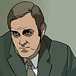
Actually?shelf wrote:Also, anyone else getting RDJ vibes from the one face in the album artwork? Kinda threw me at first.

-
noveltywave

- Boqurant
- Posts: 71
- Joined: Sun Jul 21, 2024 1:32 pm
Re: Inferno Artsyle Discussion
If this is a trilogy of VHS inspired “soundtrack albums” we have a post apocalyptic plague/zombie film with TH, and now an Italian video nasty horror with Inferno.
-
noveltywave
- Boqurant
- Posts: 71
- Joined: Sun Jul 21, 2024 1:32 pm
Re: Inferno Artsyle Discussion
My first thought when I opened my mail this morning and saw it was “Is this a 70s metal album? With vocals?” I wonder of it will sound like Black Sabbath. I bet there’s a badass guitar riff or two on there.
Re: Inferno Artsyle Discussion
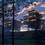
I don't think I've seen any discussion of the inner sleeve art? Combination of the posters and other stuff.
I particularly like the hints of artist Nicolas Moulin's stuff - 'alien' brutalist superstructures dropped into landscapes.
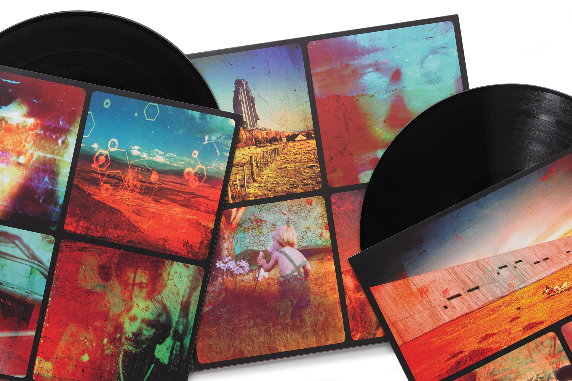
I particularly like the hints of artist Nicolas Moulin's stuff - 'alien' brutalist superstructures dropped into landscapes.