Ok, we are not going to vote yet because no one entered a full package.
I only picked those entries who start a chance of becoming a total package. In my opinion it is unnecessary to put all the covers/photos who have been posted in the artwork thread, in the upcoming poll. Those who are not included in this thread, and think they can deliver a total package in 2 weeks should contact me and I'll update this thread.
For the entries below, please submit a full package in the next 2 weeks! After that we'll start a poll, unless we only have one full package.
Deadline total package submission 24 December.
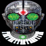
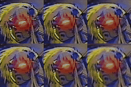
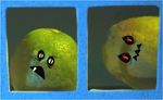
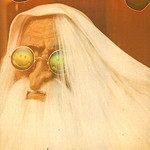
Frank: click here for high res. click here for high res.
Aesthetics wrote:Deadline total package submission 24 December.
Nice deadline--What better way to spend Christmas than deliberating beautiful artwork
I'm not sure yet who i'll be voting for. I think all three artists have great entries, but I think even their current offerings could be honed to further perfection.
The oil derricks are awesome as hell, but I get a strong sense that it just wouldn't be an overall good fit for OoT and the sounds found therein.
Frank's are excellent as well but I'm not into how busy they are or the composite of colors used, it kind of looks like a piece of metal that got dropped in a toilet and left there for a year. (no offense meant of course)
My faves from this list are Joebot's and Sarin's.
"grand mistress of the grace note freedledeedee melodies" - Cupz, 2026
turquoise70 wrote:Frank's are excellent as well but I'm not into how busy they are or the composite of colors used, it kind of looks like a piece of metal that got dropped in a toilet and left there for a year. (no offense meant of course)
Hehe yeah they're a bit too busy in my opinion as well. Got really fanatic in printing out old photos, throwing water over them, put them on top of eachother, let them dry, scan em and edit in Photoshop. It got a bit too much i think.
I like the outcome, don't get me wrong, but maybe a bit overdone for a OOT cover.
turquoise70 wrote:Frank's are excellent as well but I'm not into how busy they are or the composite of colors used, it kind of looks like a piece of metal that got dropped in a toilet and left there for a year. (no offense meant of course)
Hehe yeah they're a bit too busy in my opinion as well. Got really fanatic in printing out old photos, throwing water over them, put them on top of eachother, let them dry, scan em and edit in Photoshop. It got a bit too much i think. I like the outcome, don't get me wrong, but maybe a bit overdone for a OOT cover.
Agreed, maybe some simplification and desaturation would help.
turquoise70 wrote:Frank's are excellent as well but I'm not into how busy they are or the composite of colors used, it kind of looks like a piece of metal that got dropped in a toilet and left there for a year. (no offense meant of course)
Hehe yeah they're a bit too busy in my opinion as well. Got really fanatic in printing out old photos, throwing water over them, put them on top of eachother, let them dry, scan em and edit in Photoshop. It got a bit too much i think. I like the outcome, don't get me wrong, but maybe a bit overdone for a OOT cover.
Frank, I don't think they're overdone. They look perfect to me, and the colour scheme is just fine.
'And because our reason violently deters us from the brink, therefore do we the most impetuously approach it' E. A. Poe
after much staring at the screen, i think sarin's 'oil derricks' comes out on top...just though. but considering the theme is 'winter' then perhaps it wouldn't be as appropriate? hmm!