One on Twoism - Volume 6 [Artwork Poll] ROUND 2

Moderator: Aesthetics

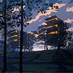
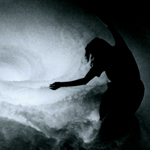
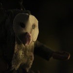
One on Twoism Volume 6 cover will be:

Poll ended at Fri May 09, 2014 8:32 pm

1 long shadows
33
43%
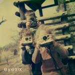
2 Perch
43
57%
 
Total votes: 76

User avatar
Aesthetics
Site Admin
Posts: 5446
Joined: Thu Nov 25, 2004 11:59 am
Location: Lowlands
Contact:

One on Twoism - Volume 6 [Artwork Poll] ROUND 2

Post by Aesthetics »

Round 2.
Will the real winner step up?
  1. Click image for original size.
  2. long shadows
    Image
    Image
    Image
    Image
  3. Perch
    Image
    Image
    Image
    Image
PS. No real progress on the mixing yet. Release date still set somewhere summer 2014.
PS2. Anyone who wants to create a microsite?
PS3. = oudated.
Life is a Frequency
User avatar
GH
Sherbet Head
Posts: 946
Joined: Thu Nov 19, 2009 6:15 pm

Post by GH »

While both great, I voted for Perch, 'cause the front reminds me of a boys storybook I had as a child.
User avatar
jcnporter
Dayvan Cowboy
Posts: 1439
Joined: Tue May 21, 2013 9:37 pm

Post by jcnporter »

It's really close. I love Long Shadows' cover, but I think Perch's overall package edges it. Both very hauntological to me.
User avatar
Mexicola
Telepath
Posts: 8882
Joined: Wed May 30, 2007 9:36 pm
Location: Dorset, UK

Post by Mexicola »

Toe to toe, they slug it out!

Image
Image

Slow down...
User avatar
BrunchTime
Posts Quantity
Posts: 121
Joined: Mon Sep 03, 2012 11:57 am
Location: America (uh-oh!)

Post by BrunchTime »

double posting is actually good
Last edited by BrunchTime on Sat Apr 26, 2014 7:51 pm, edited 1 time in total.
User avatar
BrunchTime
Posts Quantity
Posts: 121
Joined: Mon Sep 03, 2012 11:57 am
Location: America (uh-oh!)

Post by BrunchTime »

Image
User avatar
Waterbagel
Dayvan Cowboy
Posts: 1922
Joined: Sun Aug 09, 2009 12:50 am
Location: gulf coast US

Post by Waterbagel »

I'd be willing to be that this one will be just as close..
User avatar
long shadows
Friendly Stranger
Posts: 20
Joined: Mon Aug 20, 2012 5:51 am

Post by long shadows »

Just wanted to say I'm super honored that my design is in this final round. I just wanted to make sure credit is being given where its due. Polar Sky actually did the insert on my submission, and designed the final texture for the final cover image. So big credit to Polar Sky.

Also, I'm also a bit torn because I LOVE perch's design. I'm not even sure who I want to win this.
User avatar
uf0party
Posts Quantity
Posts: 105
Joined: Fri Mar 14, 2014 5:58 am
Location: missouri
Contact:

Post by uf0party »

love them both so much! great work and props to everyone involved

art is great innit
User avatar
mondo swooper70
Eagle Minded
Posts: 270
Joined: Sun Aug 01, 2010 2:16 pm
Location: Rochester, NY
Contact:

Post by mondo swooper70 »

I originally voted for longshadows, but I think Perch's design is more professional looking. Cheers to both of you, great work.
Image
User avatar
kurtnirvna
Friendly Stranger
Posts: 33
Joined: Fri May 24, 2013 4:29 pm

Post by kurtnirvna »

my vote goes to Perch again, but a sincere nod to long shadows for his incredible design. a really hard choice, for sure.
User avatar
el Cerebro
Posts Quantity
Posts: 149
Joined: Fri May 04, 2012 3:23 am
Location: Columbus, Ohio
Contact:

Post by el Cerebro »

Perch's design grows on me even more every time I look at it, especially after hearing a little about how it was made; and in the end it gets my vote.
I tip my hat to all the participants--I'd be delighted if my tunes were included on a disc adorned by any of the beautiful and unique designs submitted for the contest! Brilliant work to all...
Cerebro See Through Red Eye

www.soundcloud.com/miiiimuzik
User avatar
Goiter Sanchez
Dayvan Cowboy
Posts: 1520
Joined: Thu Aug 11, 2005 7:39 am
Location: San Francisco, California
Contact:

Post by Goiter Sanchez »

Perch's is different from past artwork and strays from BoC iconography. It will also go perfectly with my submission (provided that my track is included in the end tally) ;p
I make music as Sweguno.
InstagramYouTubeSoundcloud
User avatar
DaveJ
Sherbet Head
Posts: 550
Joined: Wed Jun 06, 2012 2:50 pm
Location: Ireland

Post by DaveJ »

I like them both. And congrats to the two guys for coming so close in the last voting. But I'm a huge fan of the imagery in Perch's design, and just feel like it's much stronger as a full piece of artwork.
User avatar
ross adey
Dayvan Cowboy
Posts: 1280
Joined: Mon Mar 21, 2005 1:56 am
Location: Dublin, Ireland.

Post by ross adey »

perch gets my vote. i like long shadows's cover image but perch's is a better and more intriguing design overall.

EDIT: only thing is though - GREG on mbient?? is that a typo or did robin change his dj name??
User avatar
Perch
Eagle Minded
Posts: 253
Joined: Fri Jun 07, 2013 12:26 am

Post by Perch »

ross adey wrote:perch gets my vote. i like long shadows's cover image but perch's is a better and more intriguing design overall.

EDIT: only thing is though - GREG on mbient?? is that a typo or did robin change his dj name??
haha sorry about that. I don't know how that happened, but it was my goof-up. I was told after I submitted, and figured that if the design got anywhere all the text would have to be redone anyways
User avatar
Jonse
Happy Cycler
Posts: 3521
Joined: Fri Mar 25, 2011 3:19 am
Location: BPR. OG
Contact:

Post by Jonse »

I have an idea, since both tied in the last round and both are designs I love. Seems like Perch is ahead, and he was ahead before and I liked his design the most, but I feel both are done so well that it'd seem odd for one to be discarded. The other one has grown on me and I've been thinking about how these two could work together.

I don't expect this to be entertained, but I felt I'd propose it: what if artwork from BOTH were used? Like say one is the CD cover, the album artwork, the insert - the other is an alternate cover specifically for a certain edition. There's always that thing where the tracks are split and the other version has them like a long mixtape - the two could have separate digital artwork. Another thing would be to have the download come with both versions of the artwork as well. At the very least, the site could also incorporate both versions of the artwork, such as Perch's smoky effects and long shadows' RGB "6" and title at the top as well as the glow at the very bottom of the page (it'd be quite easy to mix the two seeing as long shadows' design is more minimal).

If it were financially possible, the physical copies could be 50/50, with a "pick your artwork" sort of thing. That's not something I expect to happen under how this compilation has been made, so it's just a what-if, but I seriously think not using components of both designs would be a waste of talent. I'd like to see what it'd look like to have Perch's back artwork with long shadows' "666" OOT thing in the upper lefthand corner and whatnot, faded and modified a bit to fit better. Maybe they could come up with something awesome mixed together.

At any rate though, the microsite should use parts of both. That would be fantastic. Opinions?

Image

'Tis just a thought. If I'm completely honest, long shadows' design and Perch's design REALLY look like a foreground/background, culminating in something amazing if assembled properly. I did that in five minutes so obviously it wouldn't compare to proper collaboration. If they combined it then the big 6 would possibly work best on the back, under track names.
Okay...now...wait for fog machine.
User avatar
2020k
Moderator
Posts: 2129
Joined: Wed Jan 26, 2011 5:47 am
Location: Pittsburgh, PA
Contact:

Post by 2020k »

PPPPERRRCCCHHHHH.

Rodheh's idea is intriguing..!
Biznasty wrote:off to the pub... /// --- ..-. ..-. / - --- / - .... . / .--. ..- -... .-.-.- .-.-.- .-.-.-

The Baddest Alt Electronic Pop Music: Twenty20k.com
How BOC feels about: Censorship | Environment | The World | A New Album
User avatar
Mexicola
Telepath
Posts: 8882
Joined: Wed May 30, 2007 9:36 pm
Location: Dorset, UK

Post by Mexicola »

I did wonder about the possibility of using the other artwork - maybe even including some of the other entries - in some kind of gatefold booklet / supplement within the CD artwork? Guessing cost would be prohibitive though.

Perch for me by the way, but both are incredible, as were the earlier entries too. Twoism really upped it's game for this year I think 8)
Image

Slow down...
mixkid
New Seed
Posts: 1
Joined: Mon Apr 28, 2014 8:05 pm

Post by mixkid »

My vote goes to Long Shadows. Perch is a great design and would make excellent album artwork for sure, but something so nostalgic and fitting about Long Shadows.
Locked