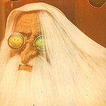
Geogaddi is really a great album package. I love the blue triangles on the back with light shining through from behind. It looks only a certain way at that scale on paper. The matte stock is perfect. And I love the alphabet soup font.
Music is my favorite though because of its simplicity. Maybe its the matte stock they used, but it just feels like an old cover, like a Carole King album. Its not too stiff or anything, and ages in the same way. So its perfect for the sound itself. And I love the blowup of the "kids" on the inside--you can just see the emuslion whizzing by as if it was being projected, with the debris and imperfection going away into time. With no intrusive credits or blather. Just art. And what a gorgeous color and font. There is a reason I think they aren't blatantly doing the 1978-80 strident and cold and warm vintage doc/public television sound, and it is because they perfectly realized it, graphically as well, the total vibe of public information through visual media broadcasted from head central, on that album. No reason to do it again. Time to explore other important ideas, but we might hear some outtakes on a future collection of old tracks, Whitewater etc..
Headphase I thought would continue the paper type, but was surprised to find it semi-matte with kind of a waxy finish I feel it might almost be waterproofed (it is not). Really gross yellows in there, but they glow with enough "focus"

The art was so complex that i had trouble associating it to what i was hearing. It represented the concept though. The last 2 covers, including IABP, look to me like the music sound-feels. This is how I personally enjoy the albums though, by associating it with the music. In my own way.
Another example of this for me would be the ELP album Tarkus, for what it is, I cant shake the cover from the very strange vibe of the album. they work together so well in a weird weird way, making it a huge and peculiar experience for me.