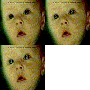
One on Twoism Volume 6 [Submission Topic]

Moderator: Aesthetics

Locked
User avatar
ross adey
Dayvan Cowboy
Posts: 1280
Joined: Mon Mar 21, 2005 1:56 am
Location: Dublin, Ireland.

Post by ross adey »

DaveJ wrote:
ross adey wrote:
polar sky wrote:Image
Image
Image
Image
Image

all images were created using my own film photographs that i shot myself. just so there is no copyright crap to deal with.
actually like this one a lot, but not too keen on the font. a/f/a imagery goes though, it's very nice.
One minor thing I'd change on this is to keep the artists/songs in line, from number 10 on they don't sit quite well, in my opinion, I'd keep em in line. Kind of a weird jump in the text.
agreed, the uneven tabbing is pretty noticeable
User avatar
polar sky
Happy Cycler
Posts: 4346
Joined: Thu Apr 13, 2006 7:20 pm
Location: US
Contact:

Post by polar sky »

ross adey wrote:
DaveJ wrote:
ross adey wrote:
actually like this one a lot, but not too keen on the font. a/f/a imagery goes though, it's very nice.
One minor thing I'd change on this is to keep the artists/songs in line, from number 10 on they don't sit quite well, in my opinion, I'd keep em in line. Kind of a weird jump in the text.
agreed, the uneven tabbing is pretty noticeable
I'll change it. There, done. And as far as a font, what are you wanting?

Image
Image
Image
Image
Image
User avatar
long shadows
Friendly Stranger
Posts: 20
Joined: Mon Aug 20, 2012 5:51 am

Post by long shadows »

Just having some fun seeing what I could come up with. Not a serious contender though. Other existing submissions are way better. Just thought I'd share.

Image
User avatar
polar sky
Happy Cycler
Posts: 4346
Joined: Thu Apr 13, 2006 7:20 pm
Location: US
Contact:

Post by polar sky »

long shadows wrote:Just having some fun seeing what I could come up with. Not a serious contender though. Other existing submissions are way better. Just thought I'd share.

Image
I like the group of sixes like that. Really cool logo.
User avatar
Mexicola
Telepath
Posts: 8882
Joined: Wed May 30, 2007 9:36 pm
Location: Dorset, UK

Post by Mexicola »

Yup - love this concept ^^^
Looks like a TV ident 8)
Image

Slow down...
User avatar
jcnporter
Dayvan Cowboy
Posts: 1439
Joined: Tue May 21, 2013 9:37 pm

Post by jcnporter »

long shadows wrote:Just having some fun seeing what I could come up with. Not a serious contender though. Other existing submissions are way better. Just thought I'd share.

Image
Very cool. I think if you did a full design it would be a serious contender.
User avatar
jcnporter
Dayvan Cowboy
Posts: 1439
Joined: Tue May 21, 2013 9:37 pm

Post by jcnporter »

polar sky wrote:
ross adey wrote:
DaveJ wrote: One minor thing I'd change on this is to keep the artists/songs in line, from number 10 on they don't sit quite well, in my opinion, I'd keep em in line. Kind of a weird jump in the text.
agreed, the uneven tabbing is pretty noticeable
I'll change it. There, done. And as far as a font, what are you wanting?
I think the font suits the darker feel of your other design better, but then I prefer your other design, although this one's great as well. Just my opinion.
User avatar
Negamuse
Dayvan Cowboy
Posts: 2122
Joined: Sat Feb 14, 2009 11:45 am

Post by Negamuse »

long shadows wrote:Just having some fun seeing what I could come up with. Not a serious contender though. Other existing submissions are way better. Just thought I'd share.

Image
Someone should take a picture of this on a shitty 80s CRT TV, as if it WAS an ident. That'd be cool.
User avatar
Mexicola
Telepath
Posts: 8882
Joined: Wed May 30, 2007 9:36 pm
Location: Dorset, UK

Post by Mexicola »

5-minute job for a giggle.
Props to Long Shadows for the original, which I think is great.

Image
Image

Slow down...
User avatar
long shadows
Friendly Stranger
Posts: 20
Joined: Mon Aug 20, 2012 5:51 am

Post by long shadows »

Hey thanks for the props. I'm thrilled that people like it. I made a CD image along the same line as well.

My concern about the design is that its so overt (and has no subtlety or texture) if anyone with a keener eye for design feels like reworking it, please have at it.

Image
User avatar
polar sky
Happy Cycler
Posts: 4346
Joined: Thu Apr 13, 2006 7:20 pm
Location: US
Contact:

Post by polar sky »

MrMessiah wrote:
long shadows wrote:Just having some fun seeing what I could come up with. Not a serious contender though. Other existing submissions are way better. Just thought I'd share.

Image
Someone should take a picture of this on a shitty 80s CRT TV, as if it WAS an ident. That'd be cool.
Image
User avatar
Negamuse
Dayvan Cowboy
Posts: 2122
Joined: Sat Feb 14, 2009 11:45 am

Post by Negamuse »

polar sky wrote:
Image
Yeah, I like that :)
User avatar
polar sky
Happy Cycler
Posts: 4346
Joined: Thu Apr 13, 2006 7:20 pm
Location: US
Contact:

Post by polar sky »

MrMessiah wrote:
polar sky wrote:
Image
Yeah, I like that :)
This could be an insert, of course it would need to be squared up: (Long Shadows, I hope you don't mind me messing with this.)

Image
User avatar
asymmetrical head
Eagle Minded
Posts: 410
Joined: Thu Aug 21, 2008 1:20 am
Location: San Diego, ca
Contact:

Post by asymmetrical head »

long shadows wrote:Hey thanks for the props. I'm thrilled that people like it. I made a CD image along the same line as well.

My concern about the design is that its so overt (and has no subtlety or texture) if anyone with a keener eye for design feels like reworking it, please have at it.

Image
Yes Polar Sky and Long Shadows! that cover would be awesome!

on the CD Long Shadows, perhaps space out the numbers so that the shapes in the middle can have some more space between them like you have on the cover design?
User avatar
rotane
Friendly Stranger
Posts: 11
Joined: Tue Feb 11, 2014 2:13 pm
Location: Austria
Contact:

Post by rotane »

polar sky wrote:Image
Juicy!

In all seriousness though, this is totally awesome.
User avatar
long shadows
Friendly Stranger
Posts: 20
Joined: Mon Aug 20, 2012 5:51 am

Post by long shadows »

Image
Polar Sky. You Nailed it. Looks awesome. How did you rework the image to get this effect?
Last edited by long shadows on Fri Mar 28, 2014 1:04 pm, edited 1 time in total.
User avatar
long shadows
Friendly Stranger
Posts: 20
Joined: Mon Aug 20, 2012 5:51 am

Post by long shadows »

polar sky wrote:
MrMessiah wrote:
polar sky wrote:
Yeah, I like that :)
This could be an insert, of course it would need to be squared up: (Long Shadows, I hope you don't mind me messing with this.)

Image
Please mess away. I love your other designs and feel honoured if anyone likes it enough to try to build on it.
User avatar
long shadows
Friendly Stranger
Posts: 20
Joined: Mon Aug 20, 2012 5:51 am

Post by long shadows »

asymmetrical head wrote:
on the CD Long Shadows, perhaps space out the numbers so that the shapes in the middle can have some more space between them like you have on the cover design?
Image

Thanks for the feedback assymetrical head. Here's a rework of the CD.
User avatar
Goiter Sanchez
Dayvan Cowboy
Posts: 1520
Joined: Thu Aug 11, 2005 7:39 am
Location: San Francisco, California
Contact:

Post by Goiter Sanchez »

polar sky wrote:Image
Oooof, that's awesome looking!
I make music as Sweguno.
InstagramYouTubeSoundcloud
User avatar
Aesthetics
Site Admin
Posts: 5446
Joined: Thu Nov 25, 2004 11:59 am
Location: Lowlands
Contact:

Post by Aesthetics »

Click image for big.

Image

Image

Image

Image

No green light yet on the use of artwork :(
Life is a Frequency
Locked