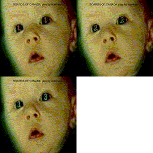
all images were created using my own film photographs that i shot myself. just so there is no copyright crap to deal with.
actually like this one a lot, but not too keen on the font. a/f/a imagery goes though, it's very nice.
One minor thing I'd change on this is to keep the artists/songs in line, from number 10 on they don't sit quite well, in my opinion, I'd keep em in line. Kind of a weird jump in the text.
ross adey wrote: actually like this one a lot, but not too keen on the font. a/f/a imagery goes though, it's very nice.
One minor thing I'd change on this is to keep the artists/songs in line, from number 10 on they don't sit quite well, in my opinion, I'd keep em in line. Kind of a weird jump in the text.
agreed, the uneven tabbing is pretty noticeable
I'll change it. There, done. And as far as a font, what are you wanting?
Just having some fun seeing what I could come up with. Not a serious contender though. Other existing submissions are way better. Just thought I'd share.
long shadows wrote:Just having some fun seeing what I could come up with. Not a serious contender though. Other existing submissions are way better. Just thought I'd share.
I like the group of sixes like that. Really cool logo.
long shadows wrote:Just having some fun seeing what I could come up with. Not a serious contender though. Other existing submissions are way better. Just thought I'd share.
Very cool. I think if you did a full design it would be a serious contender.
ross adey wrote: actually like this one a lot, but not too keen on the font. a/f/a imagery goes though, it's very nice.
One minor thing I'd change on this is to keep the artists/songs in line, from number 10 on they don't sit quite well, in my opinion, I'd keep em in line. Kind of a weird jump in the text.
agreed, the uneven tabbing is pretty noticeable
I'll change it. There, done. And as far as a font, what are you wanting?
I think the font suits the darker feel of your other design better, but then I prefer your other design, although this one's great as well. Just my opinion.
long shadows wrote:Just having some fun seeing what I could come up with. Not a serious contender though. Other existing submissions are way better. Just thought I'd share.
Someone should take a picture of this on a shitty 80s CRT TV, as if it WAS an ident. That'd be cool.
Hey thanks for the props. I'm thrilled that people like it. I made a CD image along the same line as well.
My concern about the design is that its so overt (and has no subtlety or texture) if anyone with a keener eye for design feels like reworking it, please have at it.
long shadows wrote:Just having some fun seeing what I could come up with. Not a serious contender though. Other existing submissions are way better. Just thought I'd share.
Someone should take a picture of this on a shitty 80s CRT TV, as if it WAS an ident. That'd be cool.
long shadows wrote:Hey thanks for the props. I'm thrilled that people like it. I made a CD image along the same line as well.
My concern about the design is that its so overt (and has no subtlety or texture) if anyone with a keener eye for design feels like reworking it, please have at it.
Yes Polar Sky and Long Shadows! that cover would be awesome!
on the CD Long Shadows, perhaps space out the numbers so that the shapes in the middle can have some more space between them like you have on the cover design?
asymmetrical head wrote: on the CD Long Shadows, perhaps space out the numbers so that the shapes in the middle can have some more space between them like you have on the cover design?
Thanks for the feedback assymetrical head. Here's a rework of the CD.