Inferno Artsyle Discussion

Moderators: Aesthetics, Drones, Hexagon Sun

User avatar
mechanismj
Nova Scotia Robot
Posts: 5153
Joined: Thu Dec 01, 2005 3:35 am
Contact:

Re: Inferno Artsyle Discussion

Post by mechanismj »

MyKneesAreCold wrote:My only thoughts on the artwork is that the girl on the right looks like Windowlicker RDJ and the letters are placed awkwardly so that girl is all I really see.

The title, Inferno… meh. I don’t hate it, but it feels strange as a BoC album title maybe? Too on-the-nose? But at the same time I really like how brazen it is, shows strong artistic vision and energy from the brothers which is all I could really hope for. Everything else that we have so far, videos, track titles, merch, etc. are 10/10 so I am stopping myself from thinking too critically about any one detail for now. Could not be more excited, still doesn’t feel real
This album cover was the first thing I saw on my phone this morning. When I saw it I thought, "Huh? Maybe there is something wrong with the text size on my phone." After seeing the video promo, the album cover started to fit into the grand scheme of Inferno's overall promotional art direction.

I, too, thought it was brazen. Bold. And I agree fully on your strong artistic vision take. Like, it is IN YOUR FACE BIG.

I feel like artist(s) with a rabid (and really cool and smart) fanbase that have been frothing at the mouth for over a decade in times like these, they only do something like that when they are proud of what they have created.

If that is the case then I think we're all in for a treat here!
User avatar
Twoist
Dayvan Cowboy
Posts: 1053
Joined: Thu May 31, 2007 12:04 pm
Location: Scotland
Contact:

Re: Inferno Artsyle Discussion

Post by Twoist »

This feels like a consolidation of their entire aesthetic over the last thirty years. Give us the hexagons, give us the burnt orange, the seventies doom vibe, the soulless faces, the cult worshippers and leaders, the decay, the evil, the end of the world, the whole fucking lot. I'm all in.
User avatar
Altruizine
Eagle Minded
Posts: 309
Joined: Tue Nov 10, 2009 5:51 pm

Re: Inferno Artsyle Discussion

Post by Altruizine »

Maybe the cover's growing on me a bit with the huge text and all.

I can see the brothers being pestered by people for 13 years saying "When's the new BOARDS OF CANADA album coming out? I want a new BOARDS OF CANADA album!" And finally they're responding "well here you fucking go"
User avatar
zeoevil
Dayvan Cowboy
Posts: 1105
Joined: Thu Jul 29, 2010 8:36 am
Location: Washington

Re: Inferno Artsyle Discussion

Post by zeoevil »

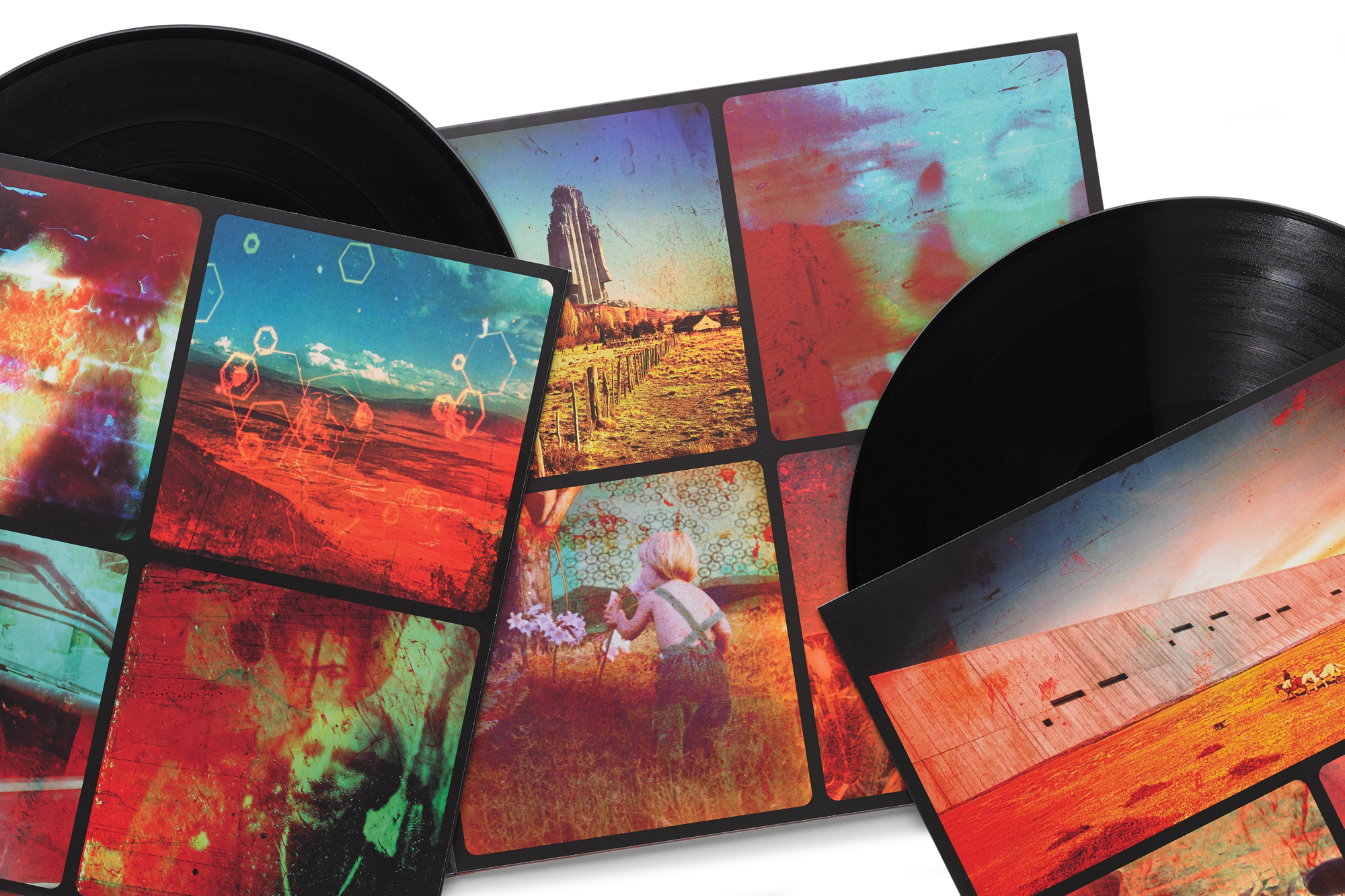
jcnporter wrote:I don't think I've seen any discussion of the inner sleeve art? Combination of the posters and other stuff.
I particularly like the hints of artist Nicolas Moulin's stuff - 'alien' brutalist superstructures dropped into landscapes.

Image
They changed their Spotify pic to the girl with the white eyes.
User avatar
Rikkiebags
Posts Quantity
Posts: 166
Joined: Mon Apr 29, 2013 10:22 am
Location: Dorset, UK

Re: Inferno Artsyle Discussion

Post by Rikkiebags »

noveltywave wrote:If this is a trilogy of VHS inspired “soundtrack albums” we have a post apocalyptic plague/zombie film with TH, and now an Italian video nasty horror with Inferno.
I get a Giallo vibe, definitely. And they've cited Fabio Frizzi in the past as an influence. Plus Giallo literally means yellow, reflected on the new t-shirt design.
Oh, no! Not the bees! Not the bees! Aaaaahhhhh! Oh, they're in my eyes! My eyes! Aaaahhhhh! Aaaaagghhh!
User avatar
fujee
Happy Cycler
Posts: 4012
Joined: Mon Oct 18, 2010 10:46 pm
Location: UK

Re: Inferno Artsyle Discussion

Post by fujee »

It's interesting. People seem to be critiquing this artwork based on previous albums and imagery. I get the first three LPs are 'canon' and very much fit together as a triptych, but if anything TH is the outlier and Inferno is something of a return to form.

In any case, it's best to approach each album on its own terms as a standalone project. If the visual identity makes sense with the concept and music they were shooting for, then it should be considered a success. We still have a month or so until we can answer that question.
Sagan: In order to make an apple pie from scratch, you must first invent the universe.

Basinski: I wanted Cascade to become this crystalline organism like a star or a liquid crystal spaceship, a jellyfish traveling through the galaxy…
User avatar
Den
Eagle Minded
Posts: 486
Joined: Sun Apr 12, 2026 9:19 pm

Re: Inferno Artsyle Discussion

Post by Den »

They could’ve made the cover the image of the hexagons overlaid onto the sky from the inside of the album… that would have been less confounding to our expectations. It’s all a deliberate choice.
User avatar
HappyCyclist
Posts Quantity
Posts: 248
Joined: Fri May 13, 2011 10:29 pm

Re: Inferno Artsyle Discussion

Post by HappyCyclist »

I think the aesthetic of this rollout has been a pretty mixed bag.

The new hexagon logo is fresh. A natural evolution from their previous icons. Even though it is new, the VHS tapes were instantly recognizable as Boards. The content of the tapes themselves was so low quality, but there’s enough to like there. Tape 05 was more interesting, some nice visuals.

The posters are pretty disjointed from the tapes. I only care for about half of them, and the hexagon logo, while necessary, didn’t look great superimposed onto them.

Then the website imagery is different still from the rest. I thought the landscape when it first launched was really nice, a fitting companion to the Tomorrow’s Harvest cover. The website now is great too, with the honeycomb and nuclear family. Adding another generation to the nuclear family icon is brilliant, my favorite visual yet.

As for the cover, I don’t like it. I feel like I don’t get what I’m looking at. A double exposure of a landscape and some blurry dudes standing around looking like pirates. It doesn’t feel special to me, not nearly as striking as most of the rest of their discography. I do like the colors though. I prefer about half the photos from the liner to the actual cover.
User avatar
IronMark
Eagle Minded
Posts: 391
Joined: Thu Feb 14, 2013 10:02 pm
Location: Southern Scotland
Contact:

Re: Inferno Artsyle Discussion

Post by IronMark »

If, as everyone expects, BoC are releasing an album as a commentary on the state of the world today, it's no time for subtlety. Everything in this campaign has been on the nose and in your face. It's like they're not messing around anymore, no more gentle subtleties in their approach, just a clear statement.
User avatar
Altruizine
Eagle Minded
Posts: 309
Joined: Tue Nov 10, 2009 5:51 pm

Re: Inferno Artsyle Discussion

Post by Altruizine »

noveltywave wrote:My first thought when I opened my mail this morning and saw it was “Is this a 70s metal album? With vocals?” I wonder of it will sound like Black Sabbath. I bet there’s a badass guitar riff or two on there.
The inner sleeve imagery looks a bit like "Heart Shaped Box" music video by Nirvana. Seeing as they've used guitars before they might unironically break into a few edgy riffs here and there. They're finally getting what it truly feels like to be bored and old after teenage angst has paid off well.
User avatar
rocketfalls
New Seed
Posts: 2
Joined: Thu Apr 23, 2026 12:01 pm
Location: Rotterdam, The Netherlands
Contact:

Re: Inferno Artsyle Discussion

Post by rocketfalls »

Actually, I really like the artwork. I love the font, even tho I think the font is a bit large, but overall I quite like it.
But, for me, if the cover was only the art without the font for "Boards of Canada" and "Inferno", it would be soooo good!!
User avatar
ravedamage
Friendly Stranger
Posts: 48
Joined: Sun Apr 28, 2013 10:57 pm
Location: Fife 4 Lief

Re: Inferno Artsyle Discussion

Post by ravedamage »

My first thought with the cover photo was they've just buried someone...or...some...thing...
shinealight
Friendly Stranger
Posts: 16
Joined: Sat Oct 26, 2013 7:32 pm
Location: United Kingdom

Re: Inferno Artsyle Discussion

Post by shinealight »

I love the cover the more I look it. When I look at the bright burnt orange for a while the whole cover starts shimmering for me, as if it is going to bleed through the logo. I think it is clever and the fan edits that totally miss the point baffle me.

That photo of the girl that looks like a generic horror movie photo I will never get though, I never thought Id see such an obvious piece of art in a BoC work, but at least that is only an inlay.
User avatar
Skimming Stone
Eagle Minded
Posts: 449
Joined: Mon Nov 10, 2014 7:35 pm
Location: England

Re: Inferno Artsyle Discussion

Post by Skimming Stone »

Twoist wrote:This feels like a consolidation of their entire aesthetic over the last thirty years. Give us the hexagons, give us the burnt orange, the seventies doom vibe, the soulless faces, the cult worshippers and leaders, the decay, the evil, the end of the world, the whole fucking lot. I'm all in.
100% this. I'm not sure if I'm just easy to please, but I have zero issues with any of the design choices, and I'm surprised to see this kind of mixed reception from some. To me the whole thing oozes BoC.
User avatar
layquiet
New Seed
Posts: 4
Joined: Thu Dec 24, 2020 5:16 pm
Contact:

Re: Inferno Artsyle Discussion

Post by layquiet »

IronMark wrote:If, as everyone expects, BoC are releasing an album as a commentary on the state of the world today, it's no time for subtlety. Everything in this campaign has been on the nose and in your face. It's like they're not messing around anymore, no more gentle subtleties in their approach, just a clear statement.
Not a fan of the art personally, but I like this take. It is bold and unmissable. It feels like the cover to a film score too, almost like they scored the hellish inferno we’re soon to find ourselves in.

Whatever the case, they made a deliberate and bold artistic choice and I have full faith in their intentions.
shelf
Boqurant
Posts: 69
Joined: Mon Oct 20, 2014 11:20 pm

Re: Inferno Artsyle Discussion

Post by shelf »

Unofficial album art for TAPE 05

Image
" if you are reading this you are spending too much time at your computer. go outside and get some fresh air. "
User avatar
Antares
Friendly Stranger
Posts: 36
Joined: Tue Apr 06, 2021 5:36 pm

Re: Inferno Artsyle Discussion

Post by Antares »

An observation I've had about Inferno in relation to Tomorrow's Harvest is that the biggest difference seems to be the presence of people.

TH was largely defined by a sense of absence. Everything about the album, from the artwork, to the videos, to the music itself, felt like it was taking place in a world that had been abandoned and was haunted by ghostly remnants of the past. I always heard the album as a kind of soundtrack to aliens discovering a planet with remnants of our infrastructure left but bereft of life after a cataclysmic incident.

Inferno seems to be going in the opposite direction. The biggest source of interest in the promotional videos was deciphering the faces of the people the tape was filled with. Our human yearning to find meaning and our proclivity to oppress others through this quest in the shadow of a Tomorrow's Harvest-like world seems to be one of the central themes of this release. If the promotional material comparing this LP to Societas X Tape is anything to go by, then I think we're in for an album that's going to be filled to the brim with vocal samples and references to our twisted human culture. I OVERFLOW MAN, indeed.
User avatar
Redd Panderson
Eagle Minded
Posts: 279
Joined: Fri Apr 10, 2026 12:36 pm

Re: Inferno Artsyle Discussion

Post by Redd Panderson »

I gotta say, I spent my morning with my coffee listening to the Societas X Tape and staring at the new album cover (like a normal human....I have COVID right now so I'm kinda couch ridden)

And I LIKE the vibe I'm getting from this. I feel like we are dipping into some of the darker, redder shadows that really have always been in the margins of their work. Scraps of certain photos used in the linear notes, Closes Vol. 1's weird photobook vibe. The corners we look past all too easily. It's exploding out on this one and radiant, but still BOC through and through. A molten, sweatier side

After pairing SXT and the cover I'm convinced the cover is brilliant and that we are in for something very special
Verde Hexagon Hashbrown
User avatar
Redd Panderson
Eagle Minded
Posts: 279
Joined: Fri Apr 10, 2026 12:36 pm

Re: Inferno Artsyle Discussion

Post by Redd Panderson »

Genuinely, whatever interlude is going on at 35:30 sounds exactly what I would expect to hear on Inferno with this album cover and those track titles and I'm here for it.
Verde Hexagon Hashbrown
User avatar
joshu_atx
New Seed
Posts: 9
Joined: Sat Jan 16, 2016 5:24 am

Re: Inferno Artsyle Discussion

Post by joshu_atx »

Redd Panderson wrote:Bringing in an idea I brought up in the general Inferno thread because it applies to the cover. It has to do with the idea of our past, present, and future selves being contained in this one moment and how parts of ourselves get frozen in the past.

It involves behavioral loops that get stuck on repeat in our psyches as we age and continue to manifest as similar situations in our lives over and over. It's like the negative edge of nostalgia. Not necessarily trauma, but the momentum of habit that we are often blind to while ending up in the same difficult situations time and again.

Also related to loops: feedback. The closed loop producing monstrous things with exaggerated features in our lives, dreams, and societies, frightening us until we can cultivate enough equanimity to face them head-on. I think that exaggerated, maybe even cartoonish, character of our demons when left unchecked kind of fits with the bit of camp in the design for Inferno.

I already said it somewhere else, but, to me, I'm getting the feeling this isn't strictly a dark album, but also about the process of turning to face your demons--individually and as a society--in order to transcend and move beyond them. To thaw the frozen parts inside. To befriend those exiled aspects of our psyche so we can rescue ourselves from the havoc they can wreak when left unchecked.

So I appreciate the kind of horror, kind of camp look. There's a funhouse mirror yet sinister look and I do think it all has some parallel to what some people call shadow work.
I usually just lurk here and read posts - I'm usually on keyosc (rip WATMM) and reddit - but I logged back in to tell you this is my favorite theory/interpretation so far and hits on things I struggled to articulate. My pet theory is this is an overt break from their past work of hauntology - i.e. broadly speaking an aesthetic and perspective of an imagined future vision from the past, wrestling with nostalgia, revisiting old obscure yet existing media, etc. This is a vision of the future, or some other perspective defying linear space/time, where even the concepts of memory and humanity are a mystery. I think that's why there are subtle distinctions to be made of the artwork, the track listing, and the media they've previewed so far. It feels like no longer an exploration of memories and past zeitgeists but veering into more liminal ambiguity and unknown dimensions and worlds.

https://forum.keyosc.com/topic/1980-inf ... ment-56573
Post a reply