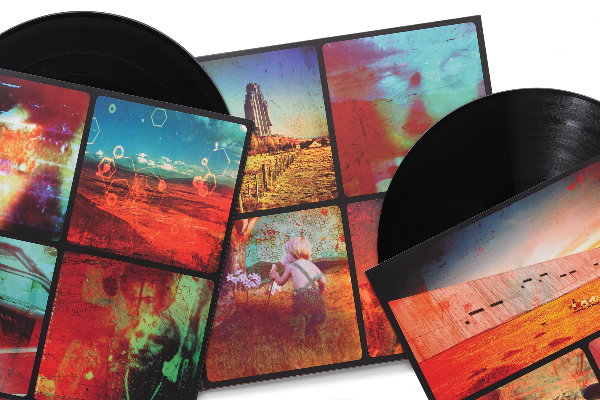
This album cover was the first thing I saw on my phone this morning. When I saw it I thought, "Huh? Maybe there is something wrong with the text size on my phone." After seeing the video promo, the album cover started to fit into the grand scheme of Inferno's overall promotional art direction.MyKneesAreCold wrote:My only thoughts on the artwork is that the girl on the right looks like Windowlicker RDJ and the letters are placed awkwardly so that girl is all I really see.
The title, Inferno… meh. I don’t hate it, but it feels strange as a BoC album title maybe? Too on-the-nose? But at the same time I really like how brazen it is, shows strong artistic vision and energy from the brothers which is all I could really hope for. Everything else that we have so far, videos, track titles, merch, etc. are 10/10 so I am stopping myself from thinking too critically about any one detail for now. Could not be more excited, still doesn’t feel real
I, too, thought it was brazen. Bold. And I agree fully on your strong artistic vision take. Like, it is IN YOUR FACE BIG.
I feel like artist(s) with a rabid (and really cool and smart) fanbase that have been frothing at the mouth for over a decade in times like these, they only do something like that when they are proud of what they have created.
If that is the case then I think we're all in for a treat here!